
Redefining the design strategy of the flagship entertainment channel of the media holding.
In late 2017, I was invited to join TNT Marketing department in an effort to redefine and supervise the design of the channel across all media, with the role of Art Director and Director of the TNT Design department.
Leading an in-house team of 50+ awesome and uber talented designers that literally adopted me, we started a long and progressive journey in the redefinition of the channel image within the framework of a new creative vision.
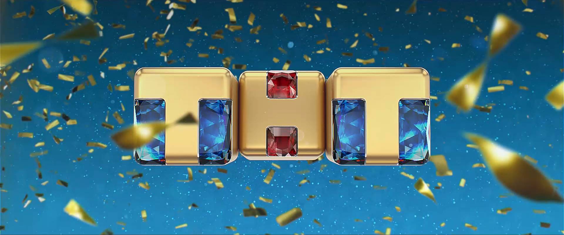
The first challenge was to decide how to handle the logo.
The channel logo, in fact, was very well known and belowed across Russia 7 timezones. However, it started to show its age, especially within the context of an incredible boost in content production value — that the channel profited from through the strategic acquisition of the best in class russian production companies in 2017.
Therefore, our proposal was to redesign the logo through a process of evolution rather than revolution — injecting new life in the company mark without losing the appeal to its core audience.
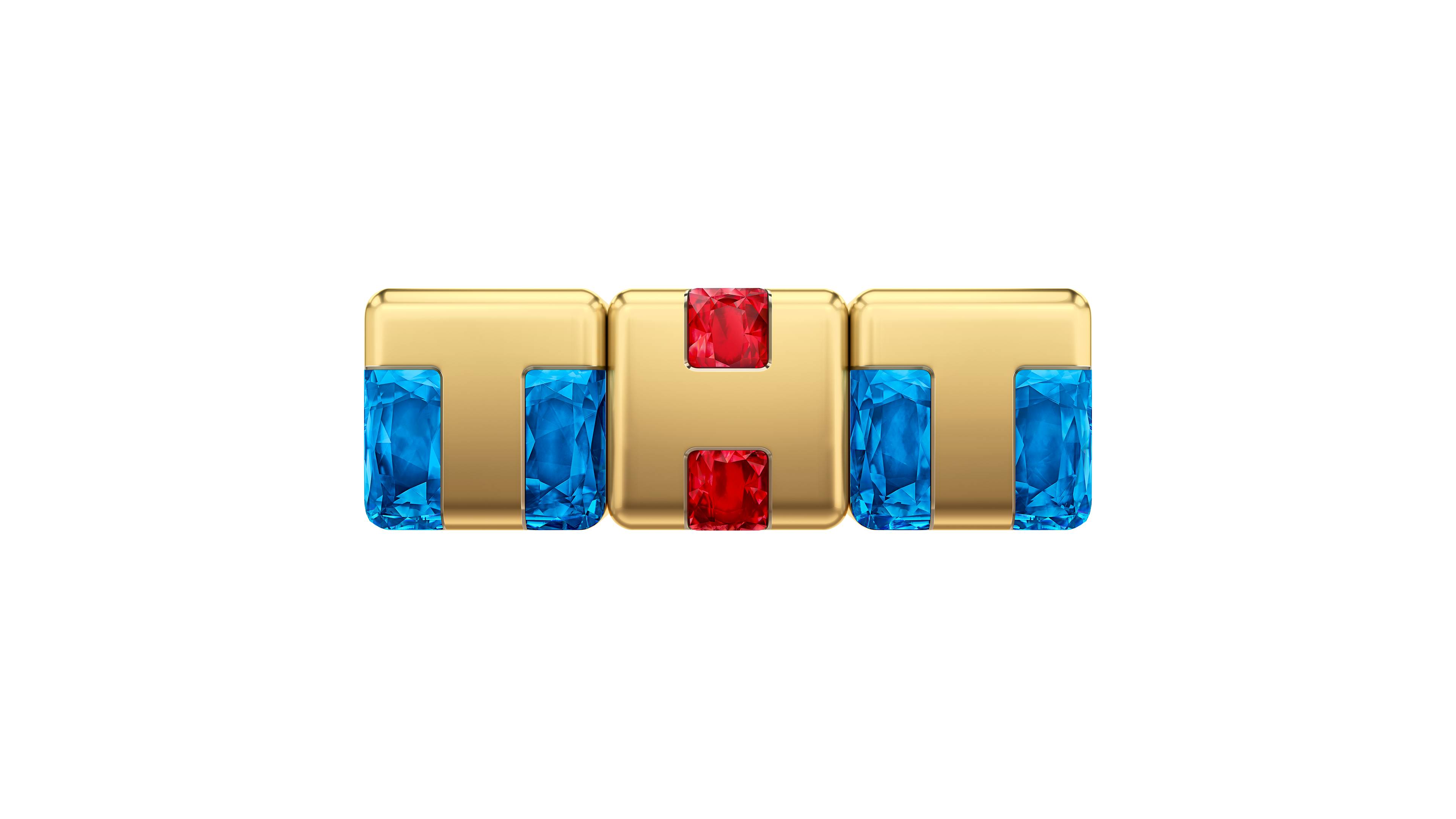
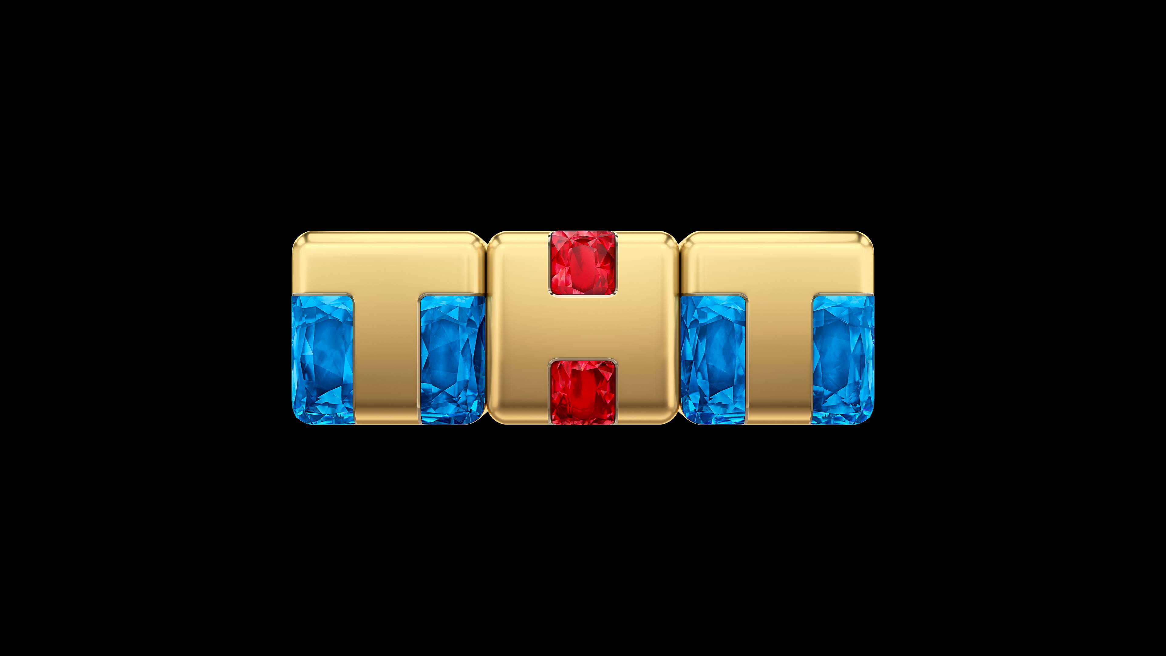
For the first time, a secondary version of the logo was implemented — with a digital first application in mind, an environment in which the previous logo surely faced some serious challenges, especially at reduced size.


The following step was the definition of a brand typeface.
The requirements were challenging: the typeface needed both cyrillic and latin glyphs, match with the strong yet at times cumbersome personality of the logo, and at the same time be able to communicate (or at least fit) a plethora of different contents airing on the channel. Finally, it was critical for it to have a web version.
The choosing of Rubik, a Google font, on top of checking all these requirements, prevented the channel from investing a large sum of time in the design of a bespoke typeface, or a hefty sum of money in licensing fees.
Together with a stalinist colour palette, we had the three cornerstone of our brand image set.


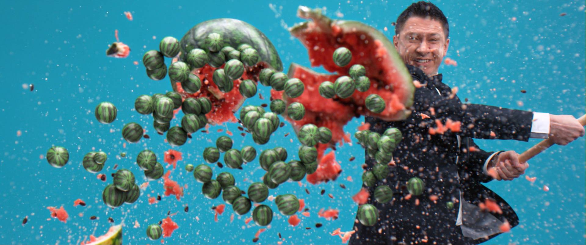
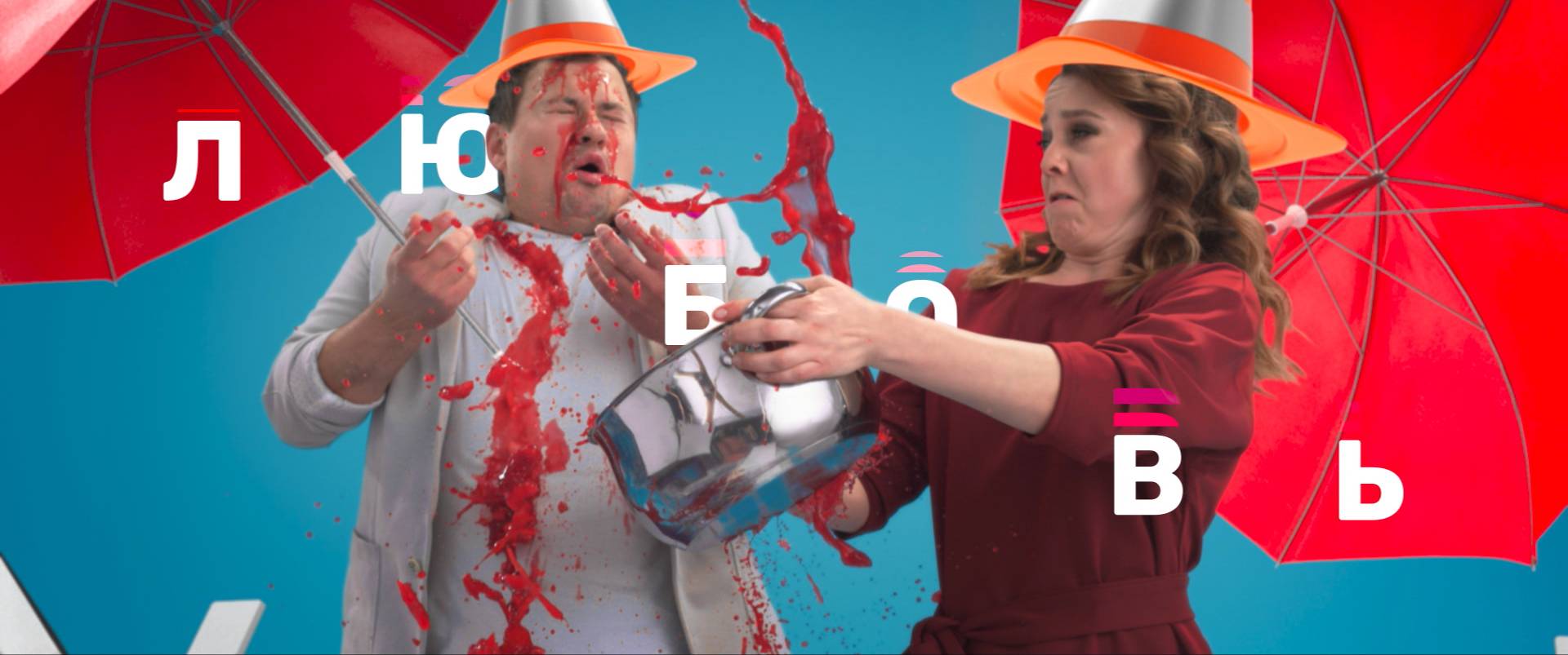
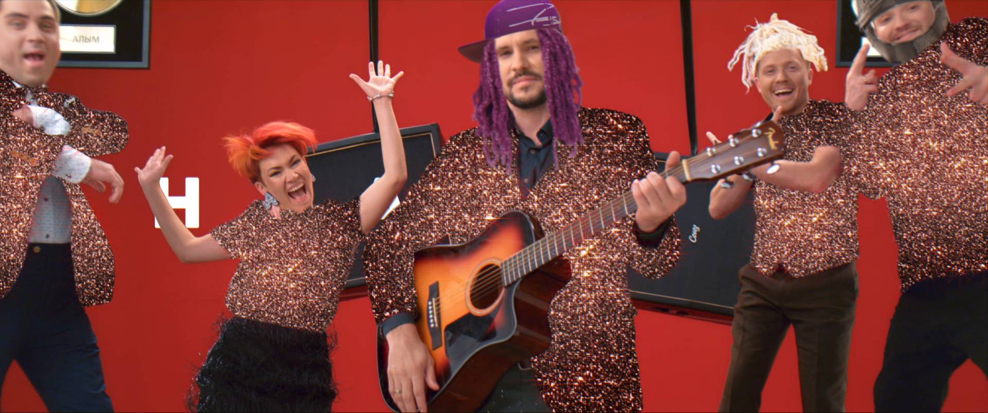
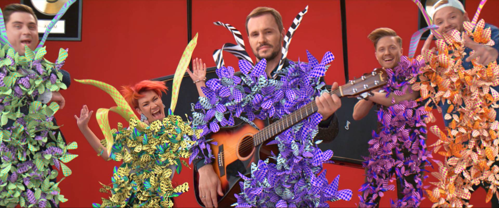
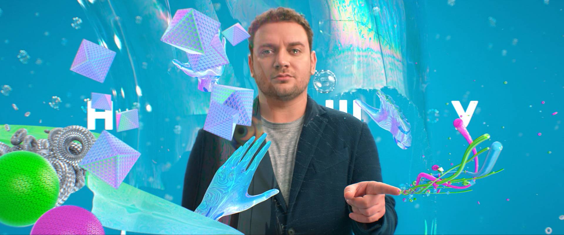
Throughout the years, several iterations of IDs lived on the channel.
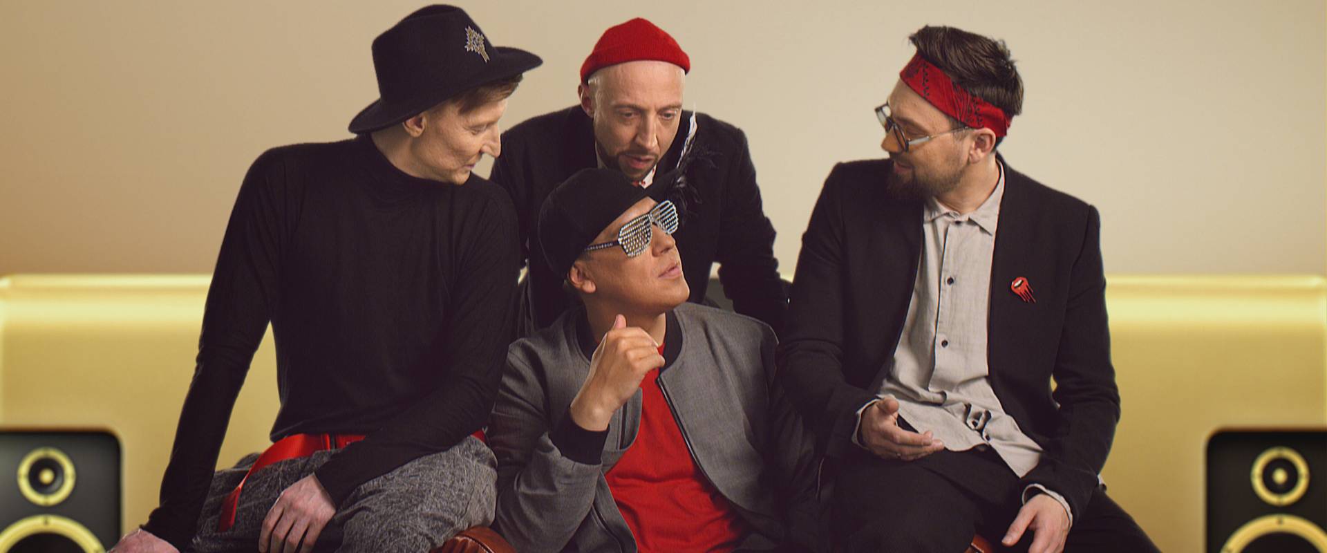
Their absolute pro was undoubtedly the incredible roast of hosts, beloved and known in the whole country.
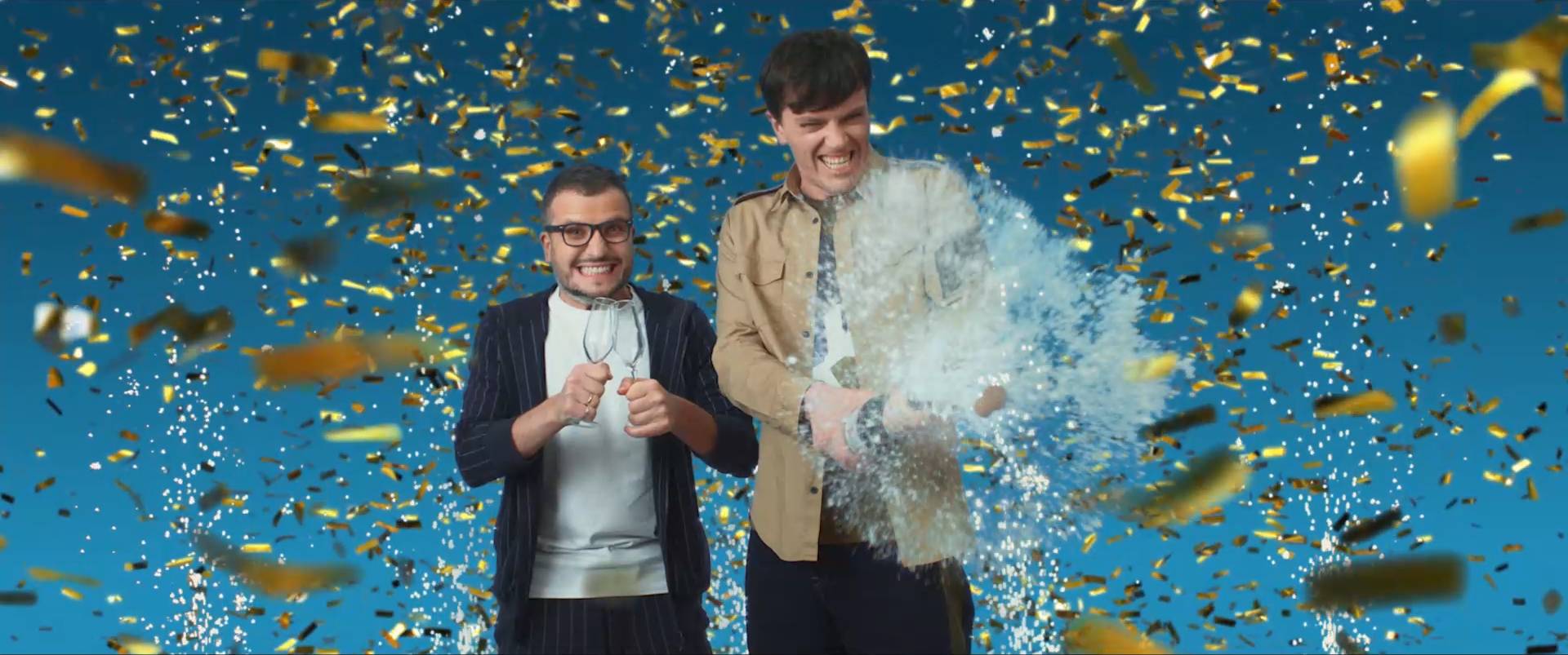
However, there was an issue: the idents featured the talents telling a joke. This posed two business critical issues: the first, was the ratio between production costs vs. how long an ident could air before becoming boring for the loyal audience. The second, was the cumbersome scheduling of long IDs of a different lenght, that subtracted precious air-time to the promotion of the content and the adv space of a linear channel.
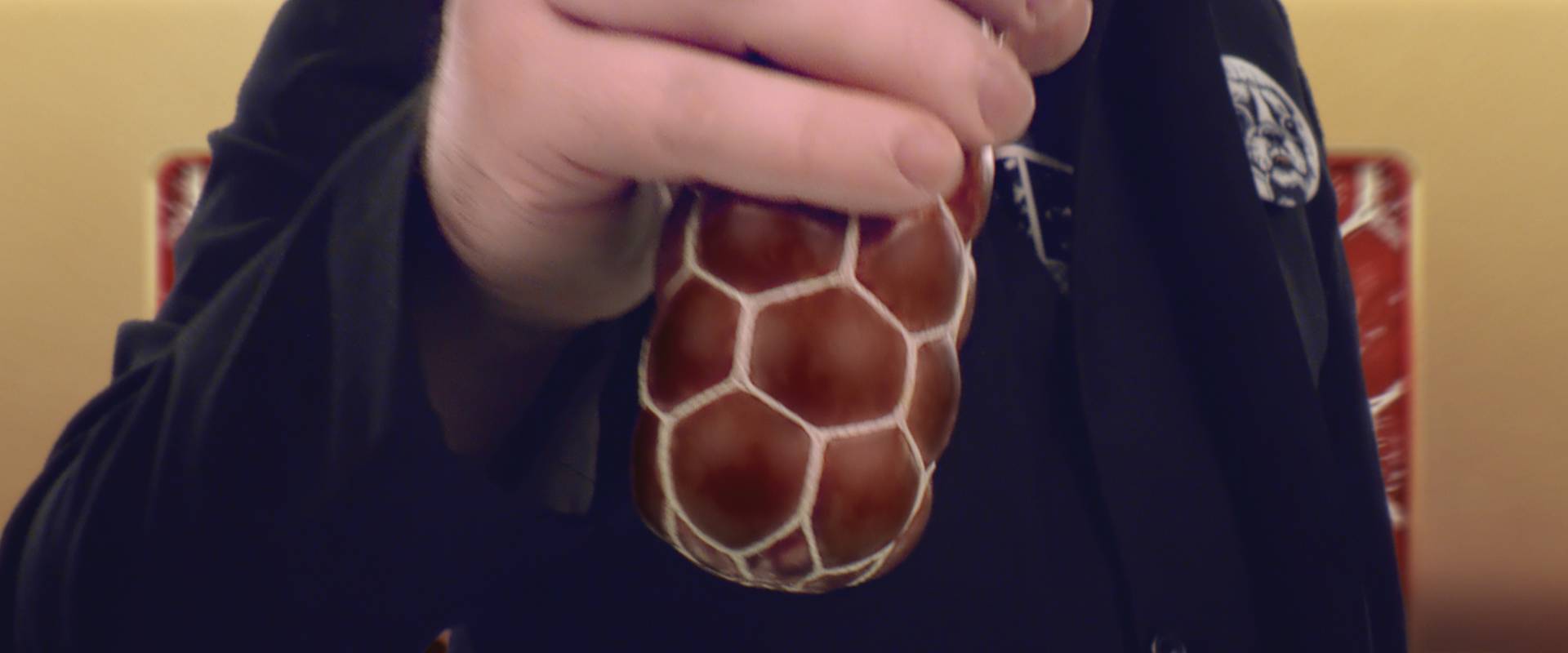
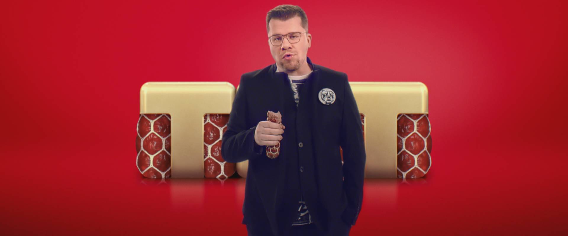
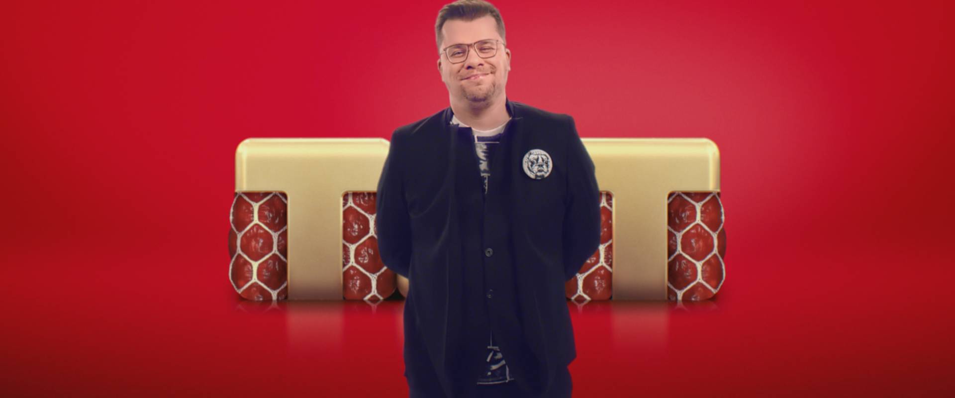
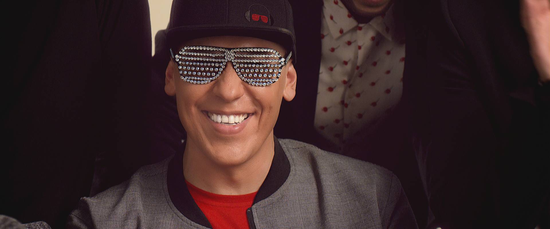
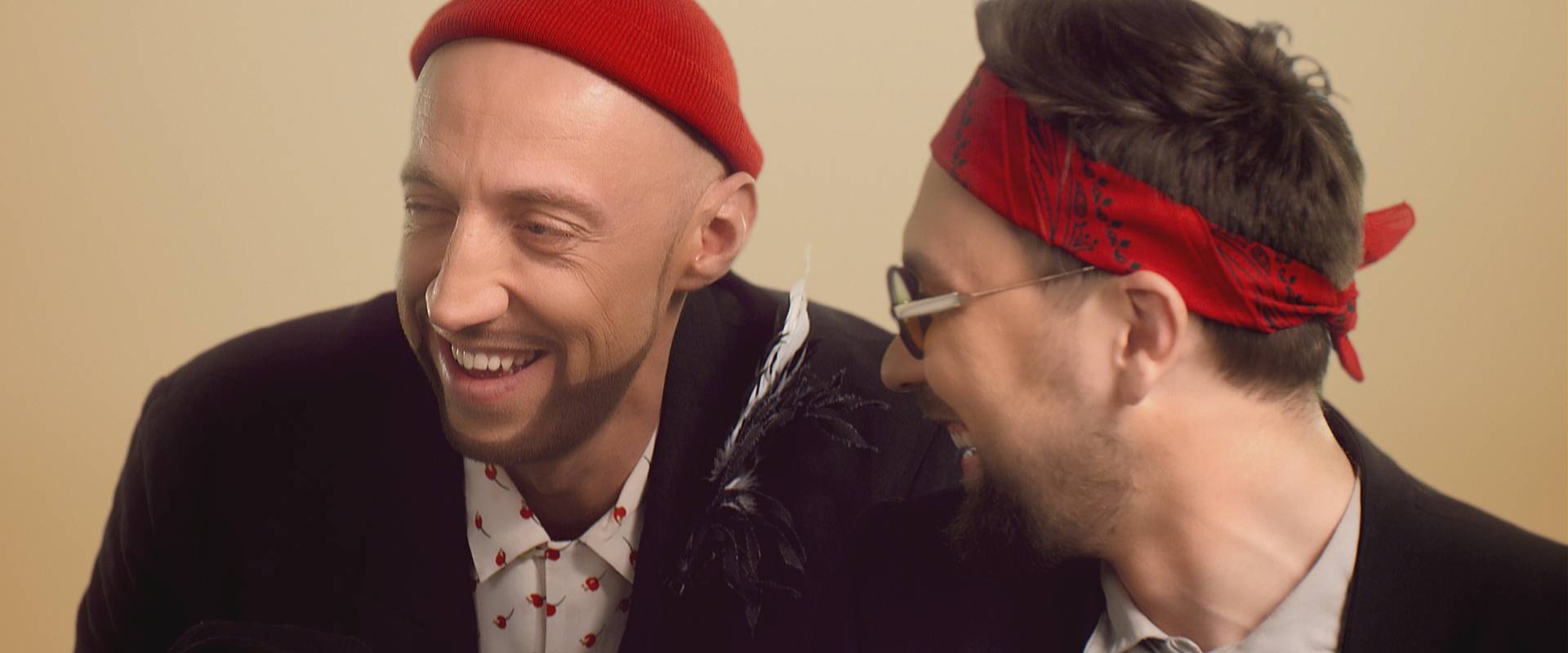
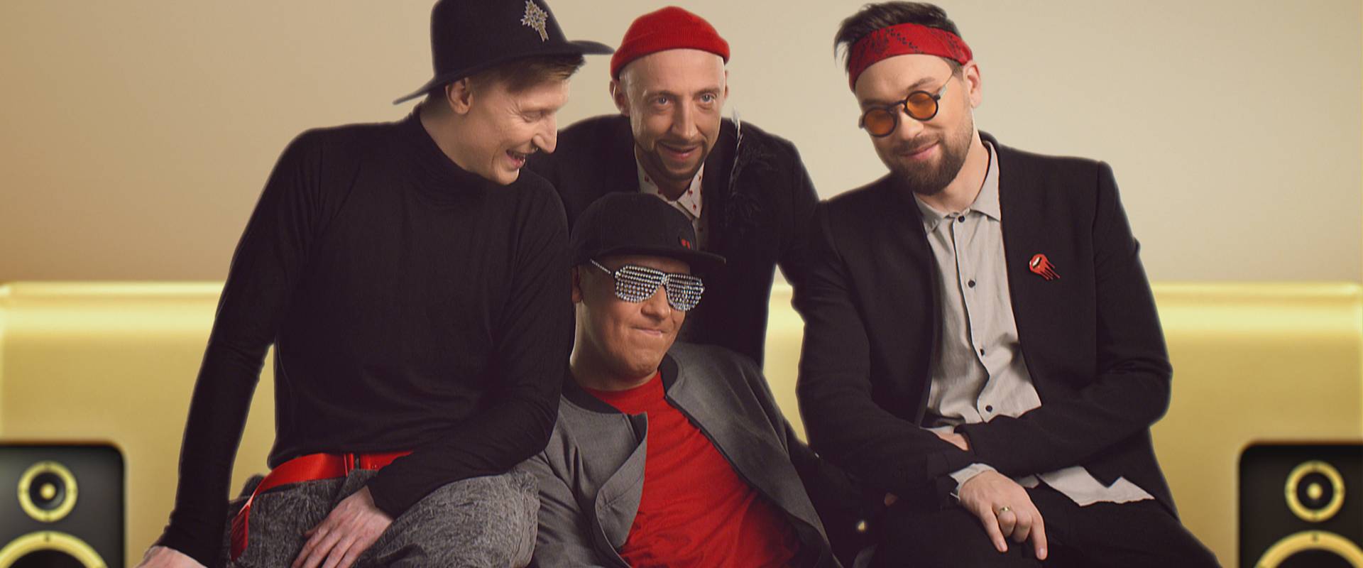
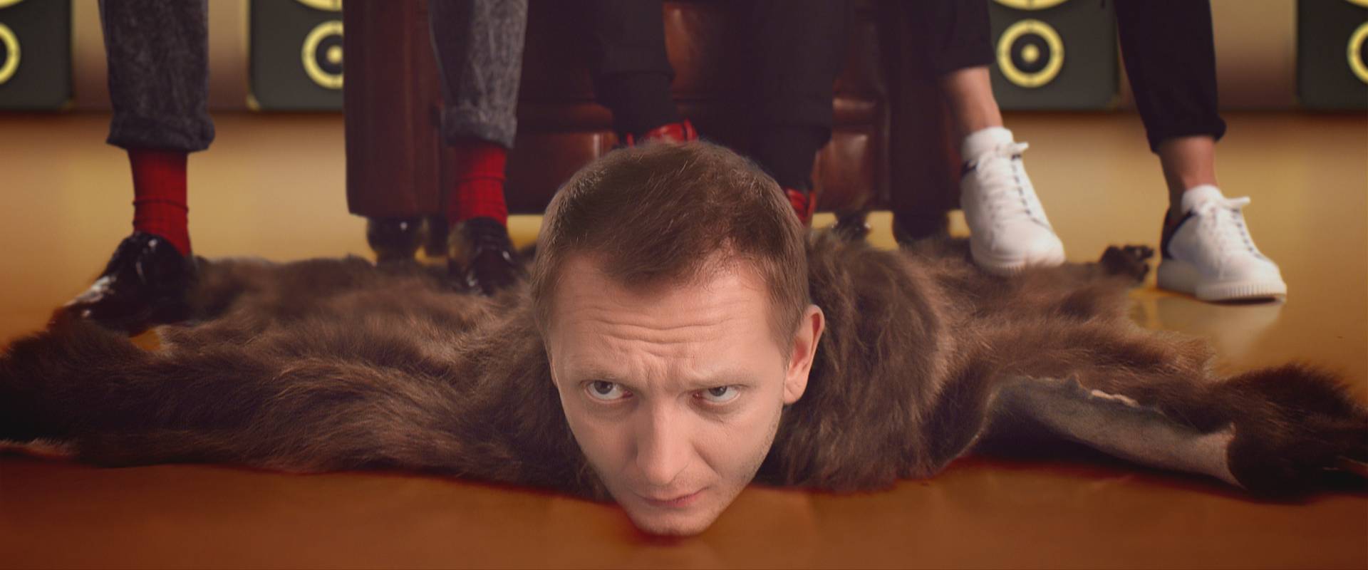
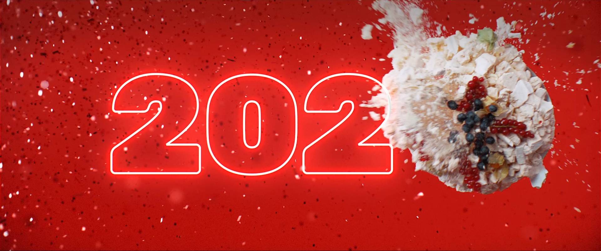
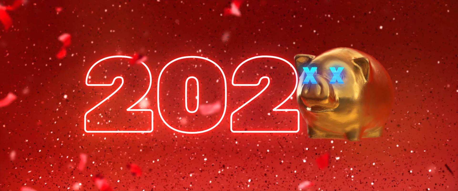
The solution was fairly simple: move from a scripted structure to a more abstract, direct and timeless approach.
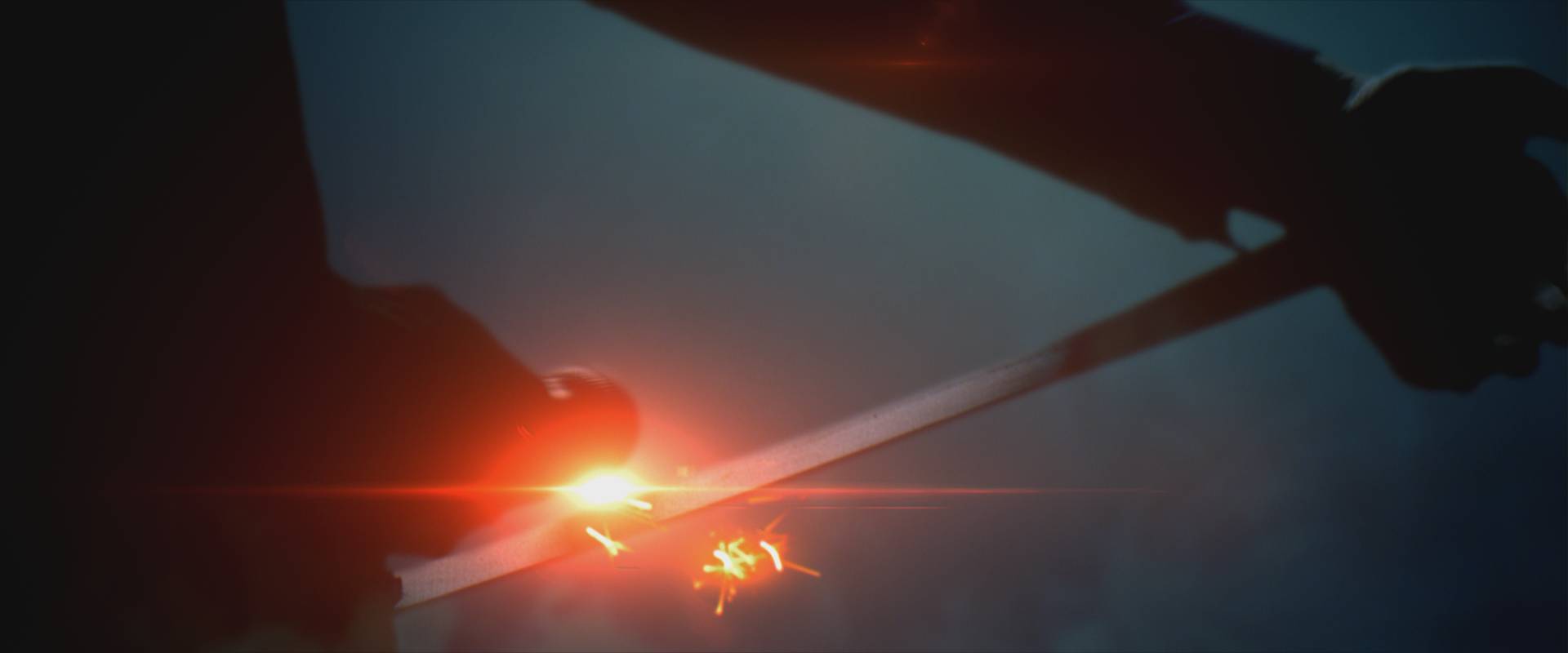
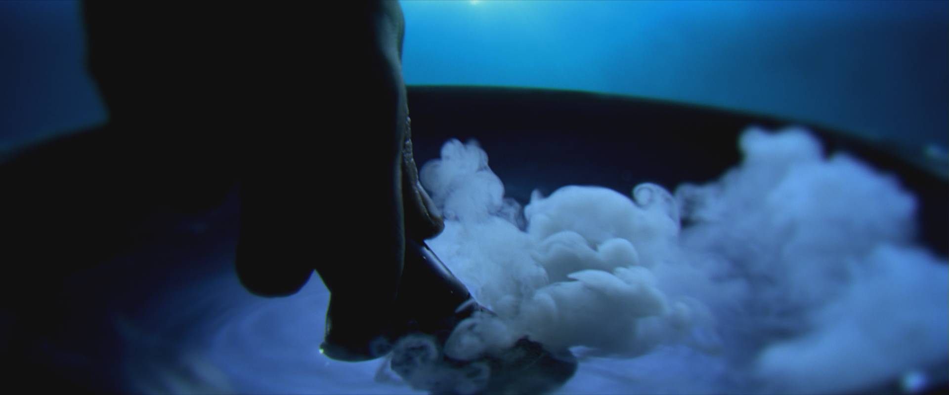
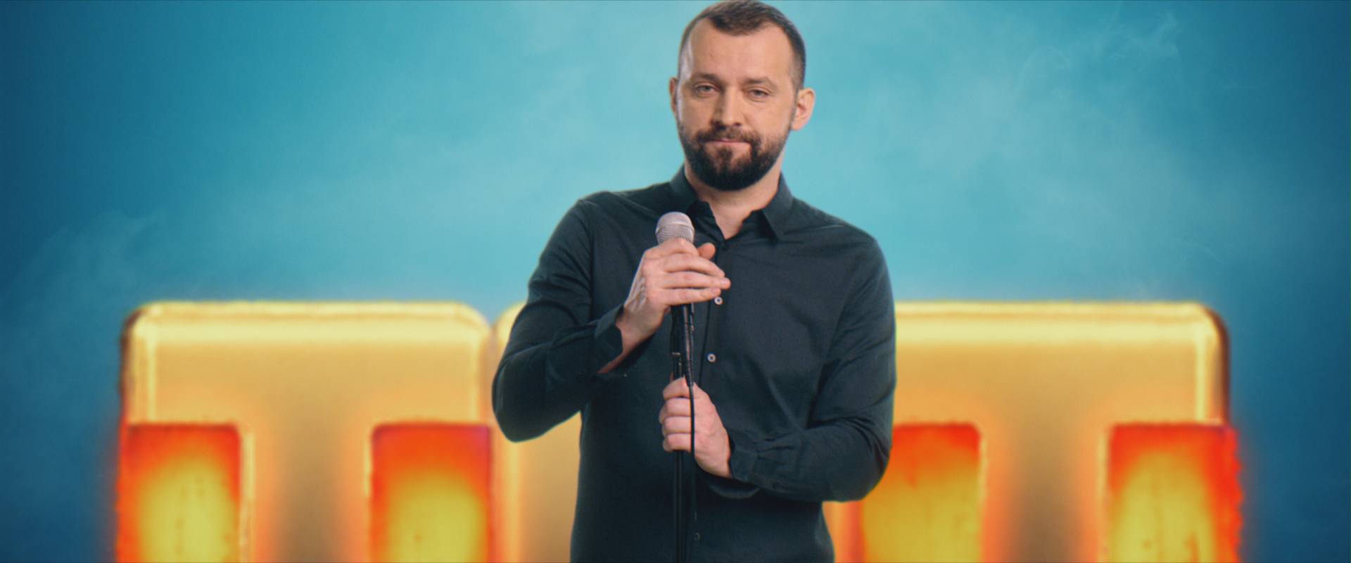
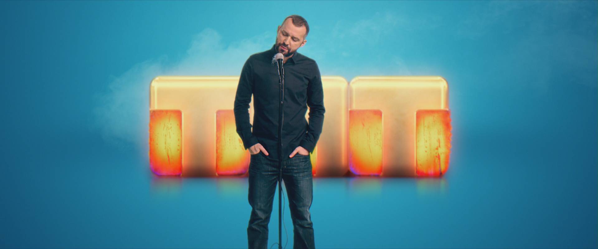
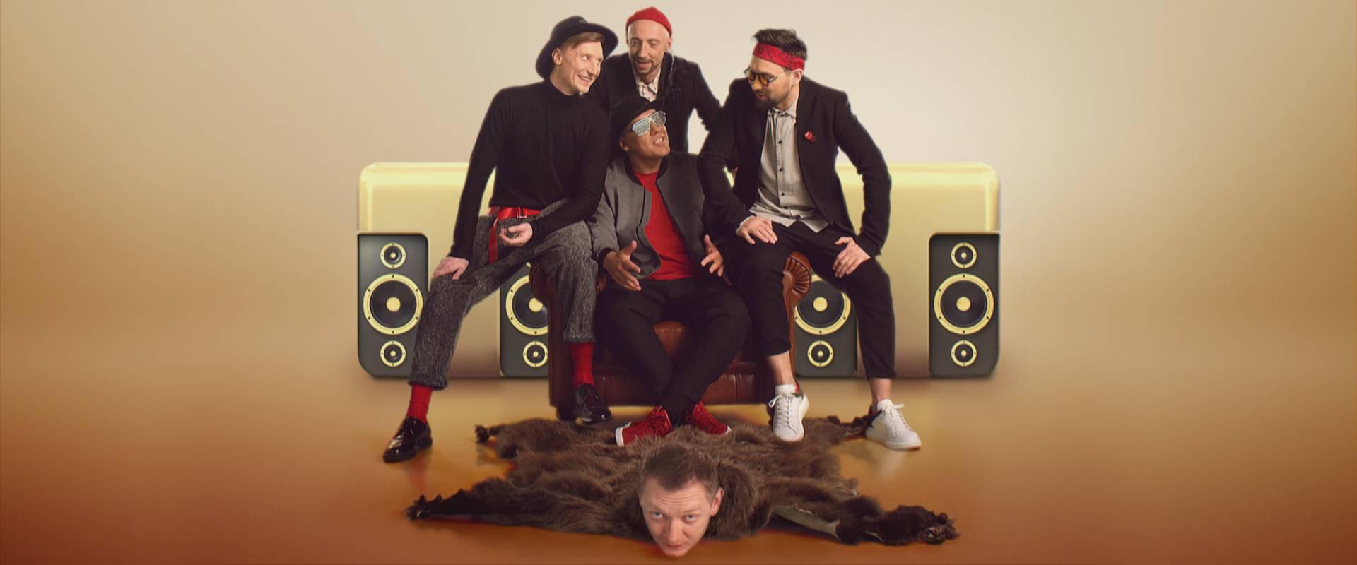
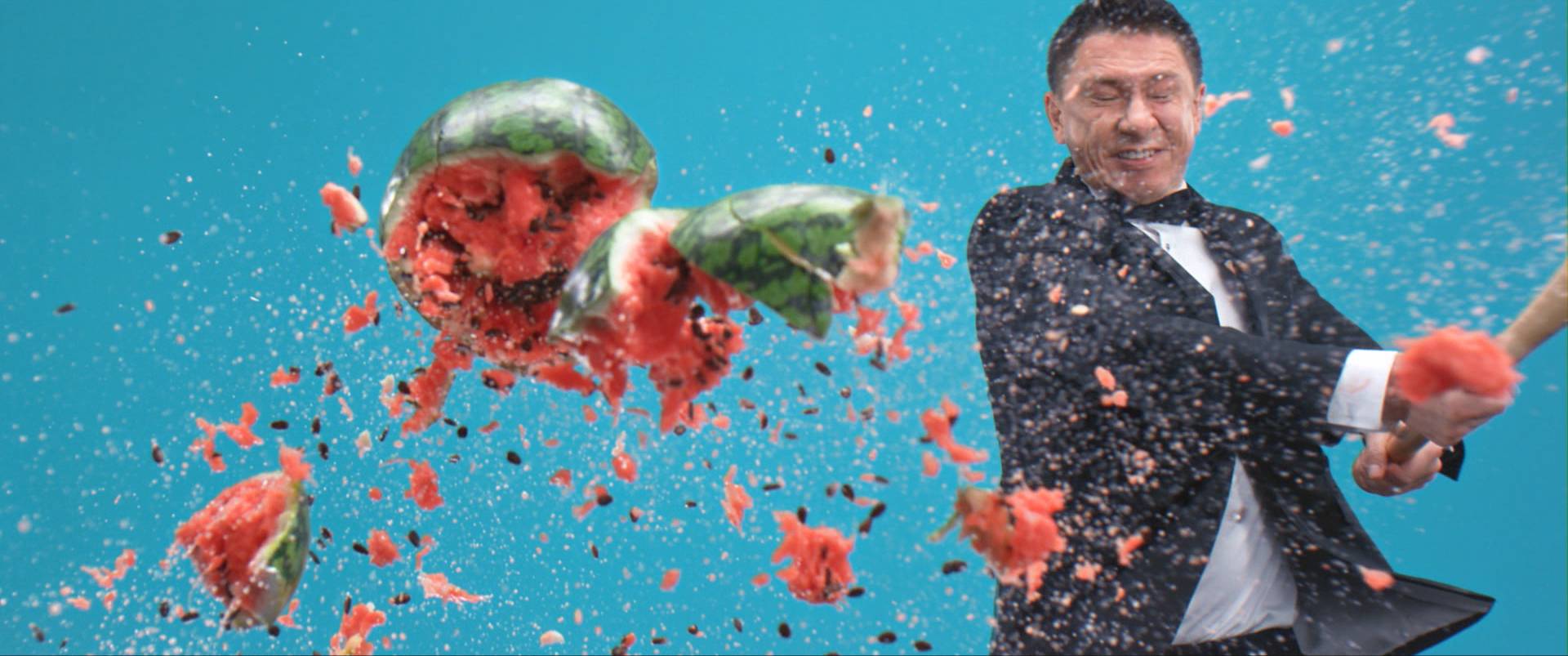
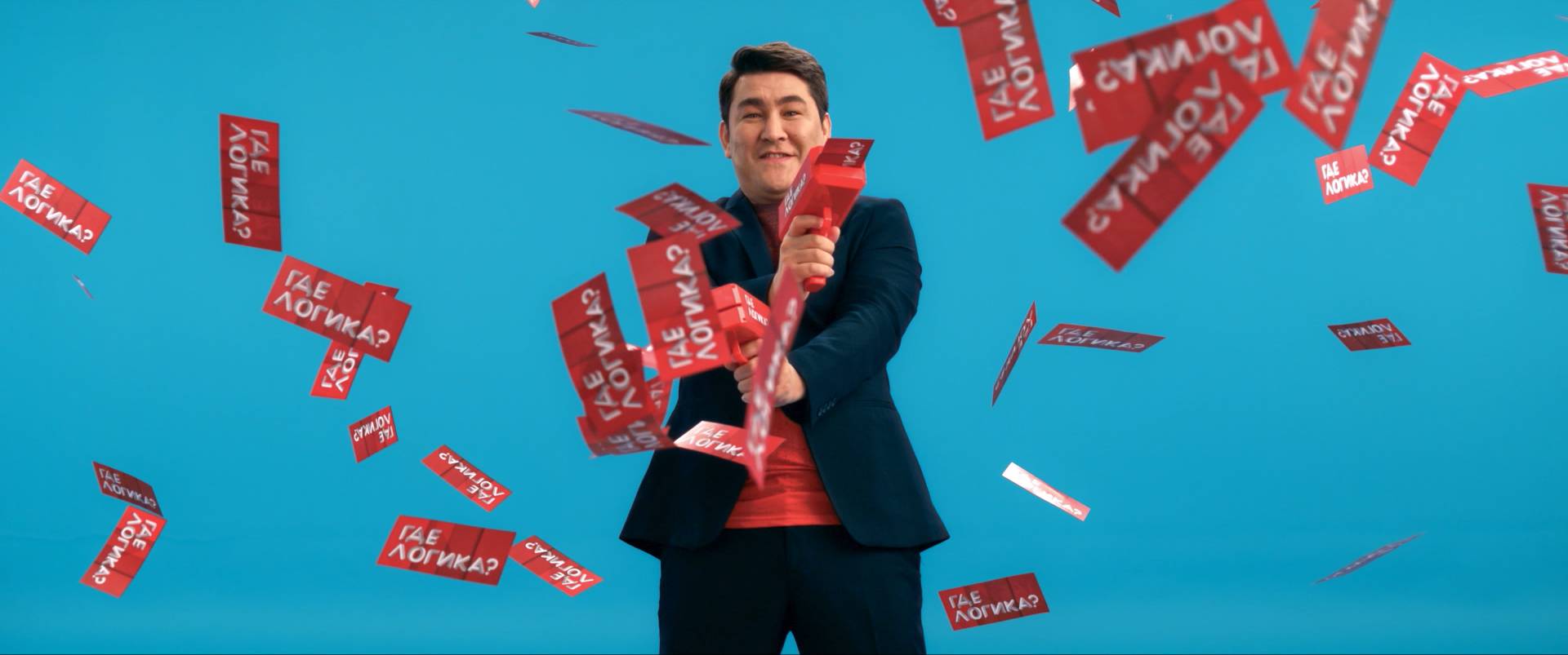
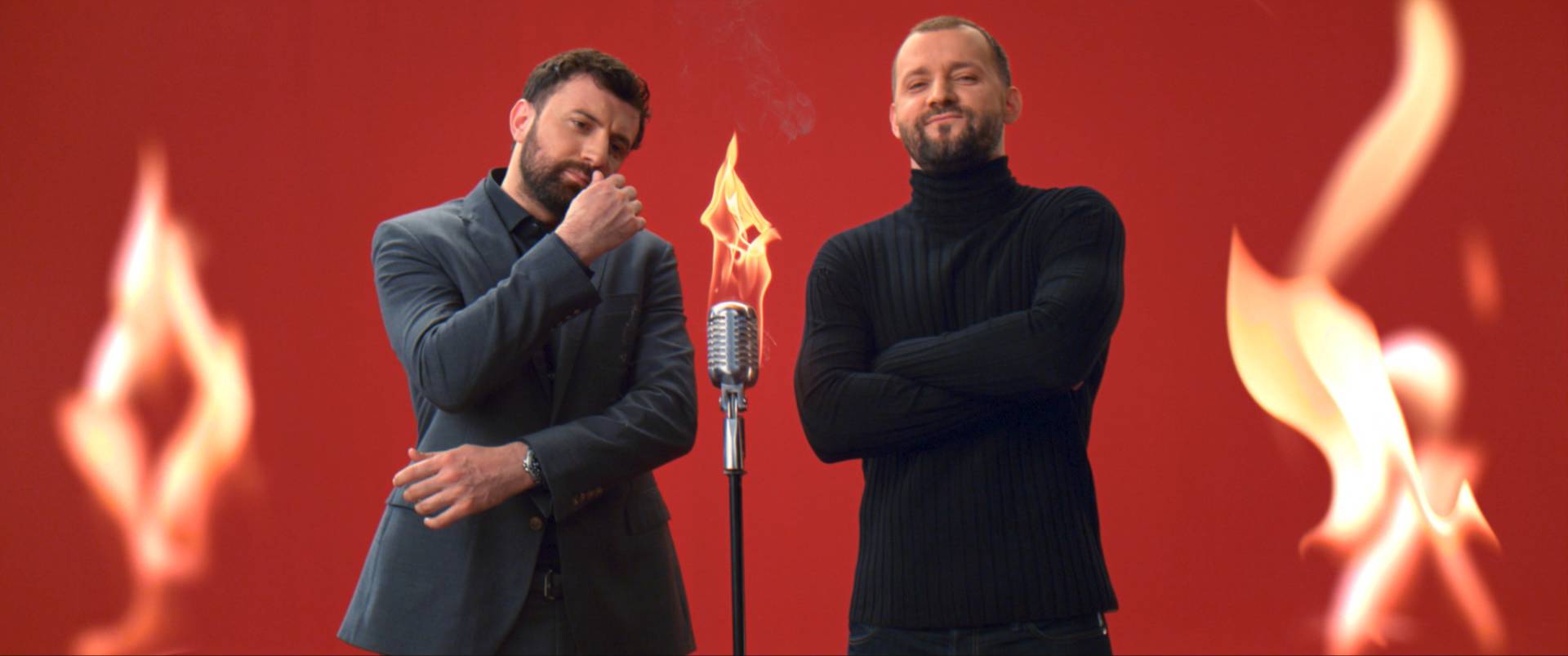
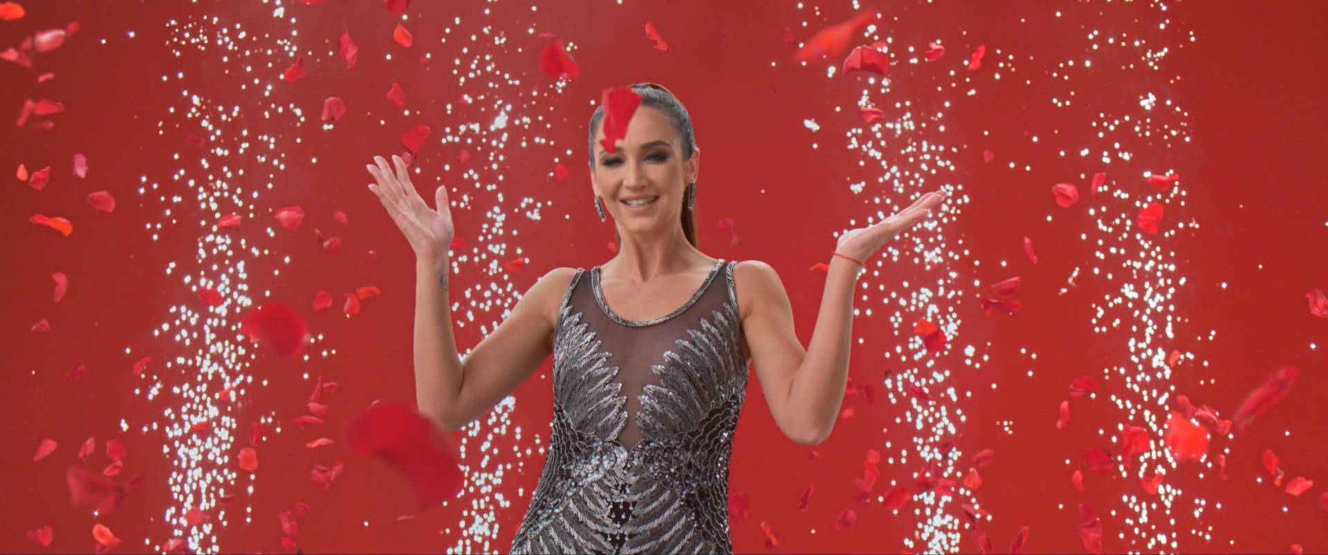
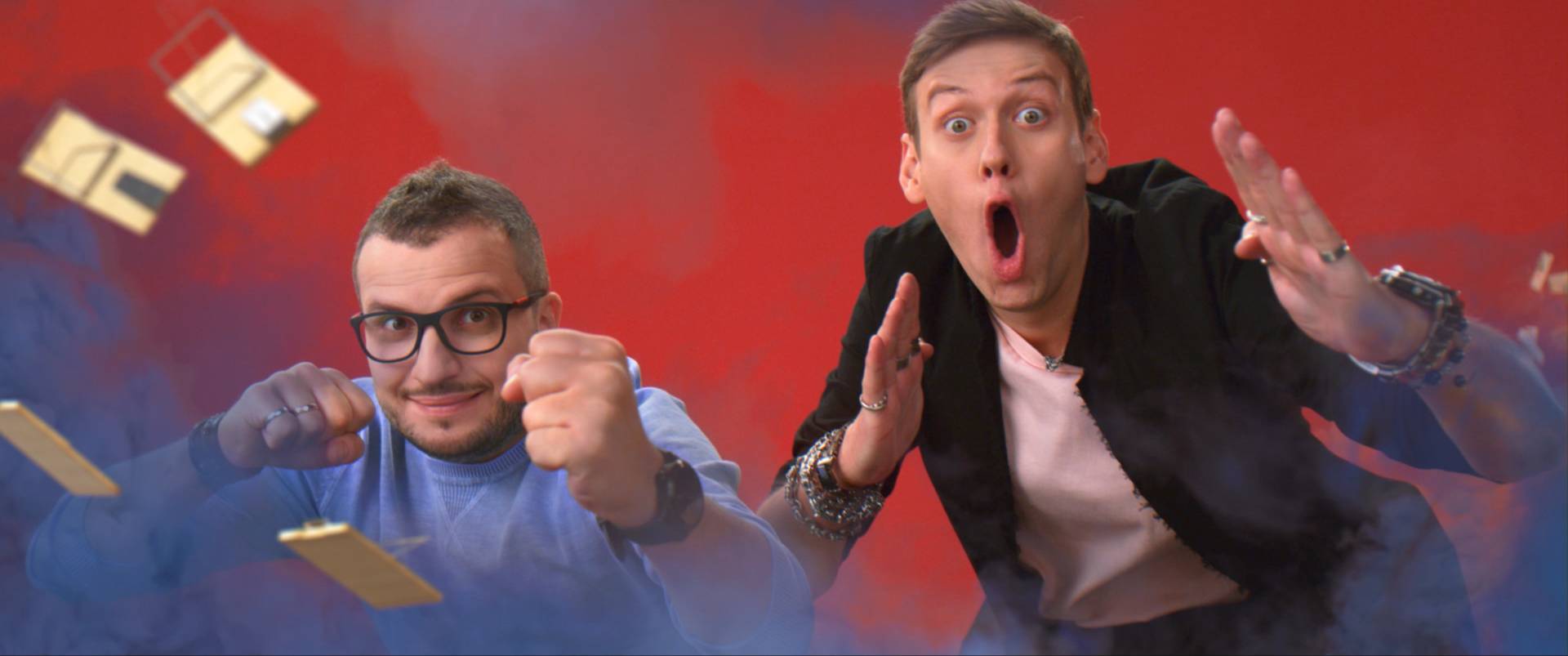
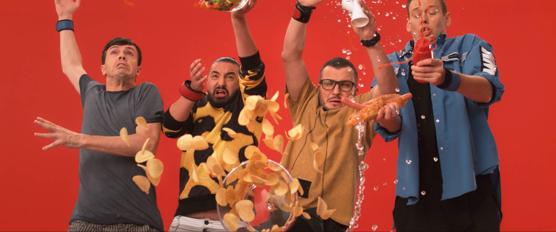
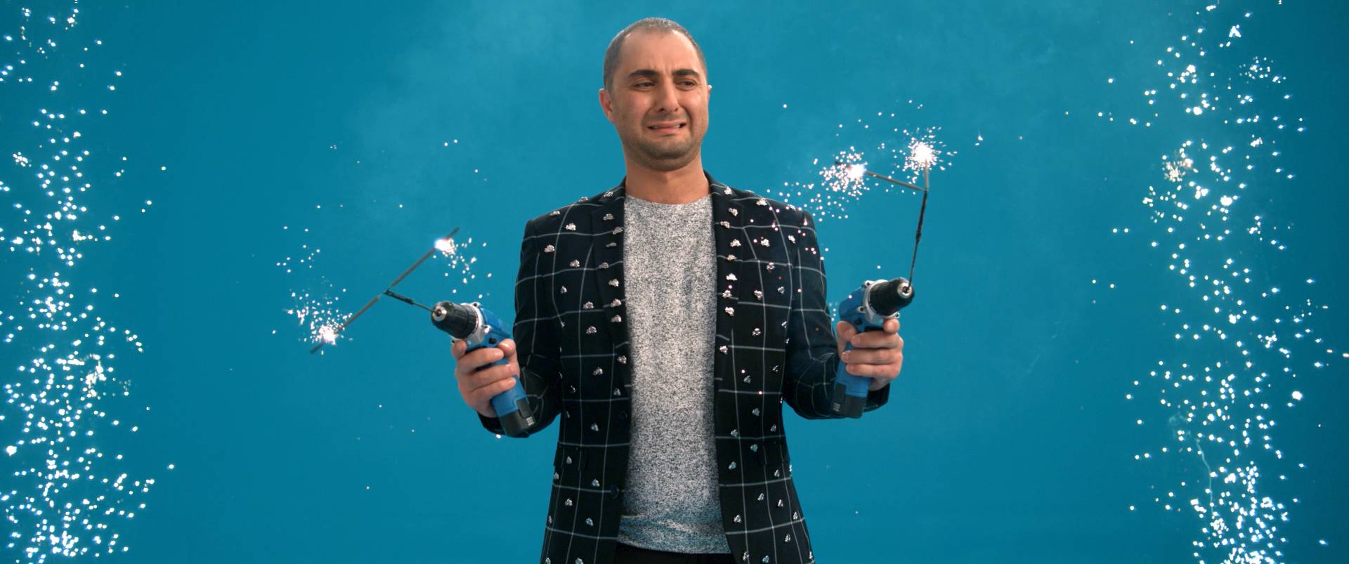
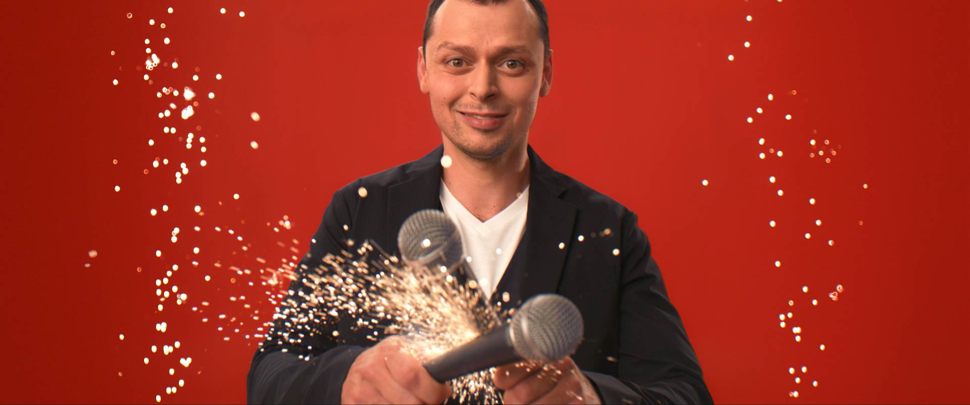
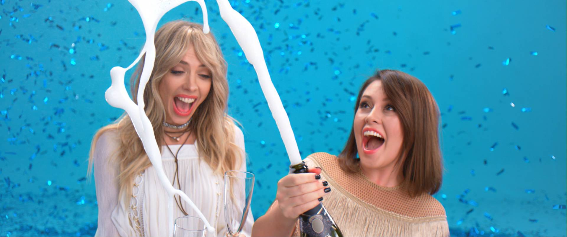
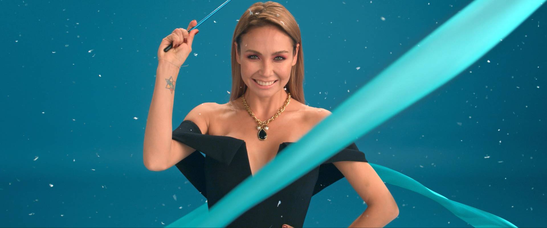
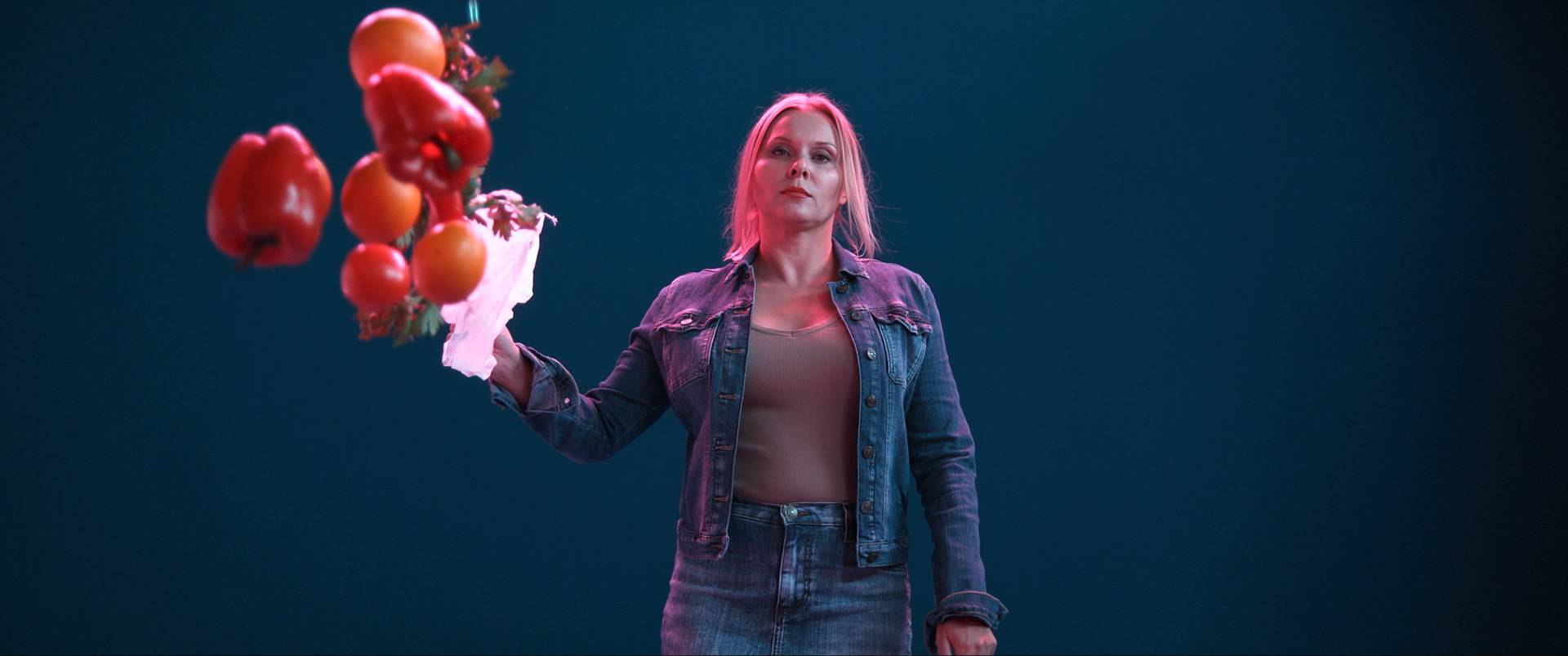
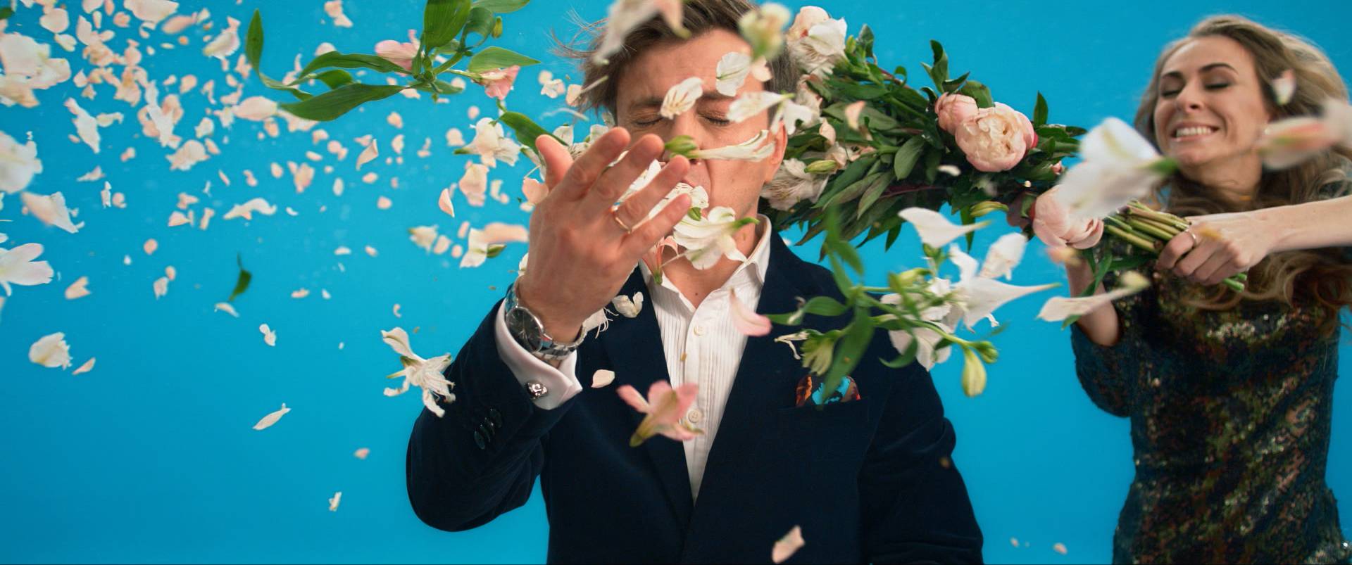
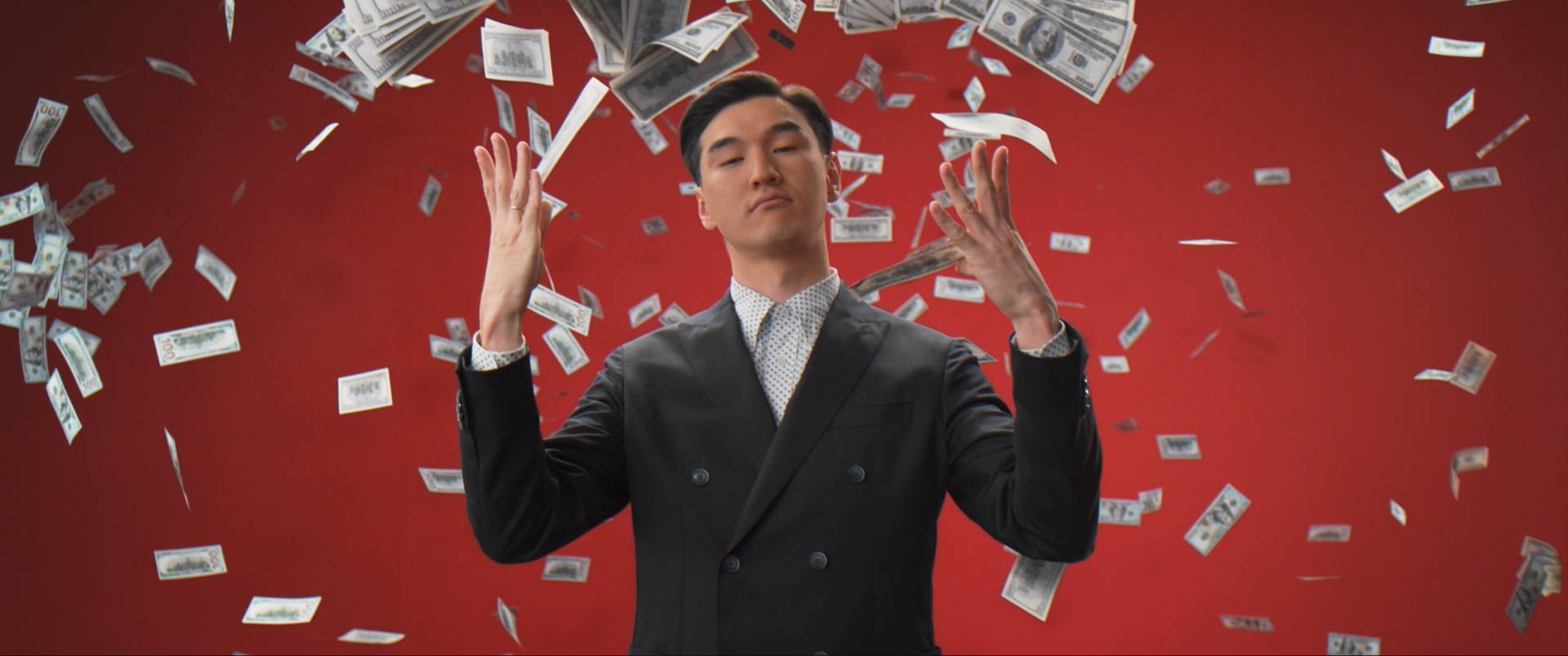
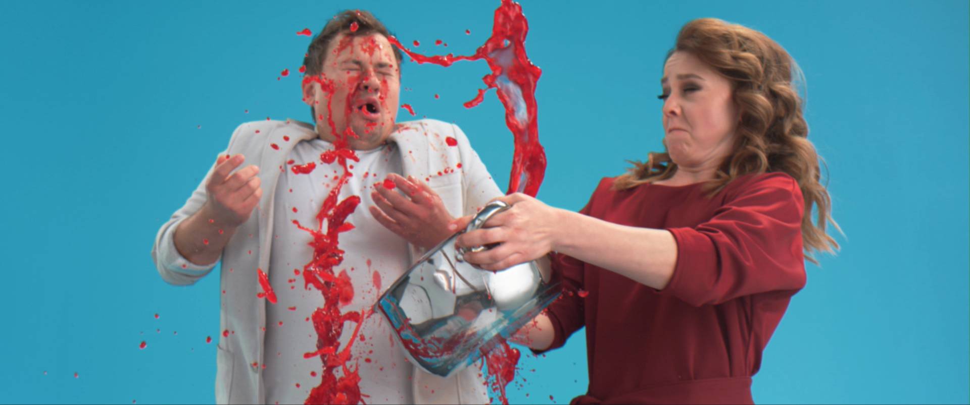
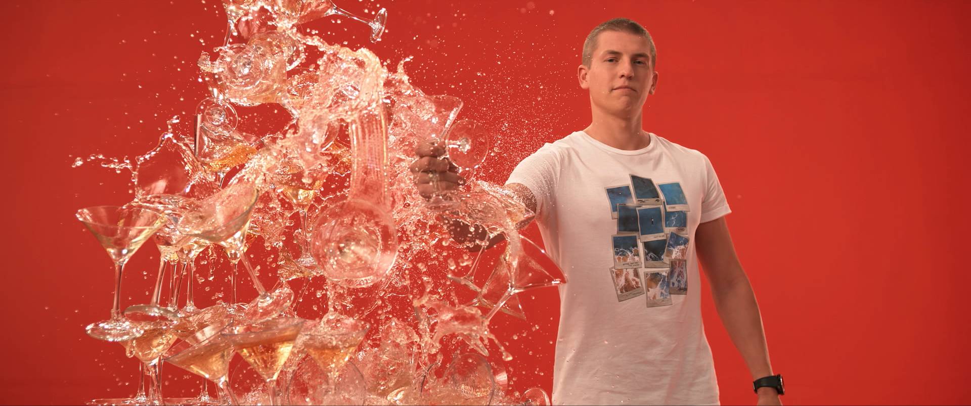
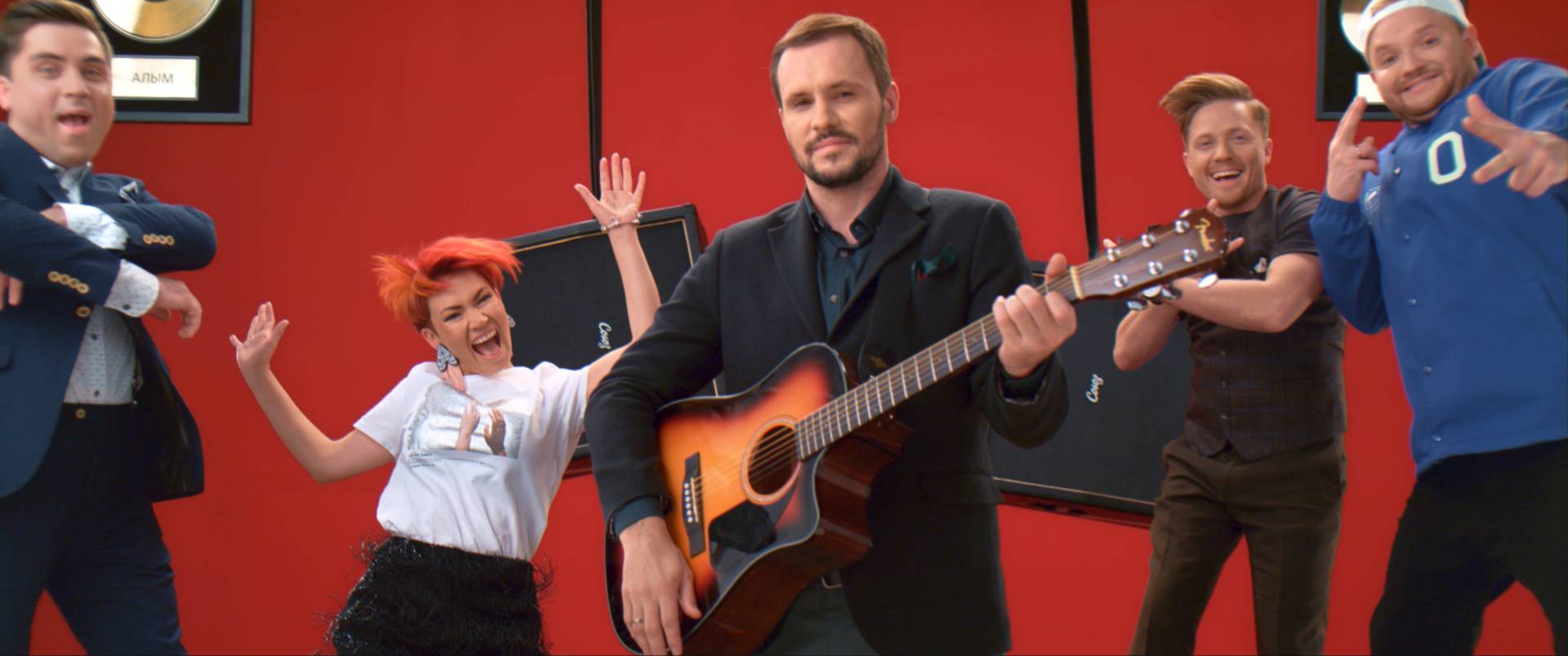
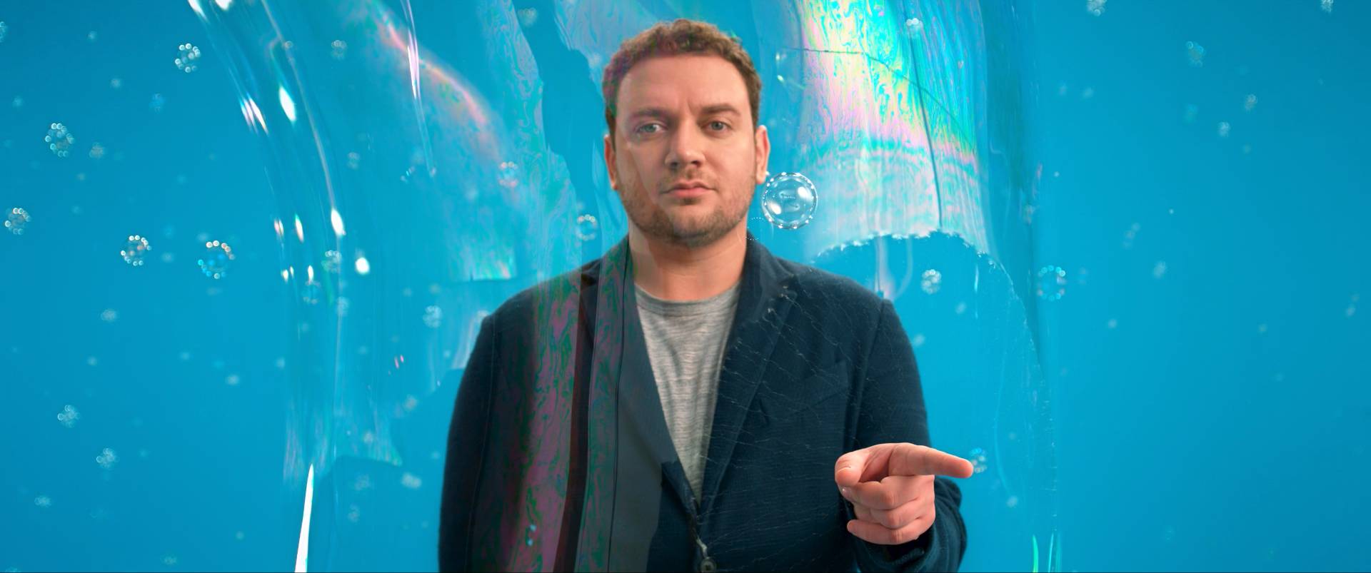
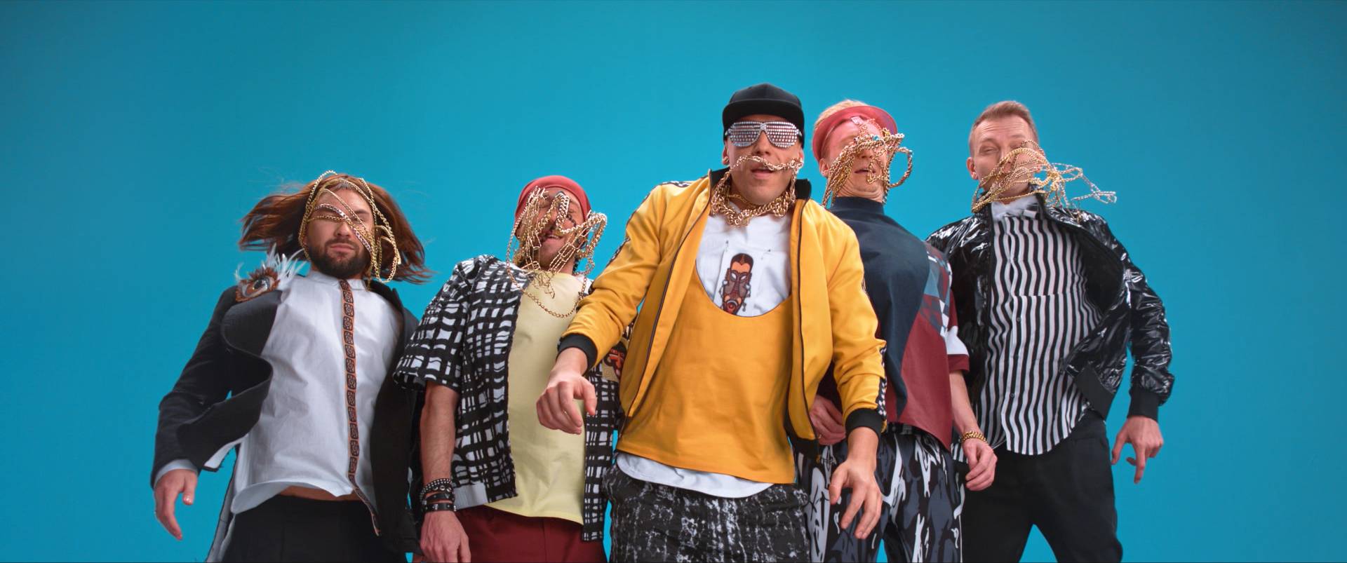
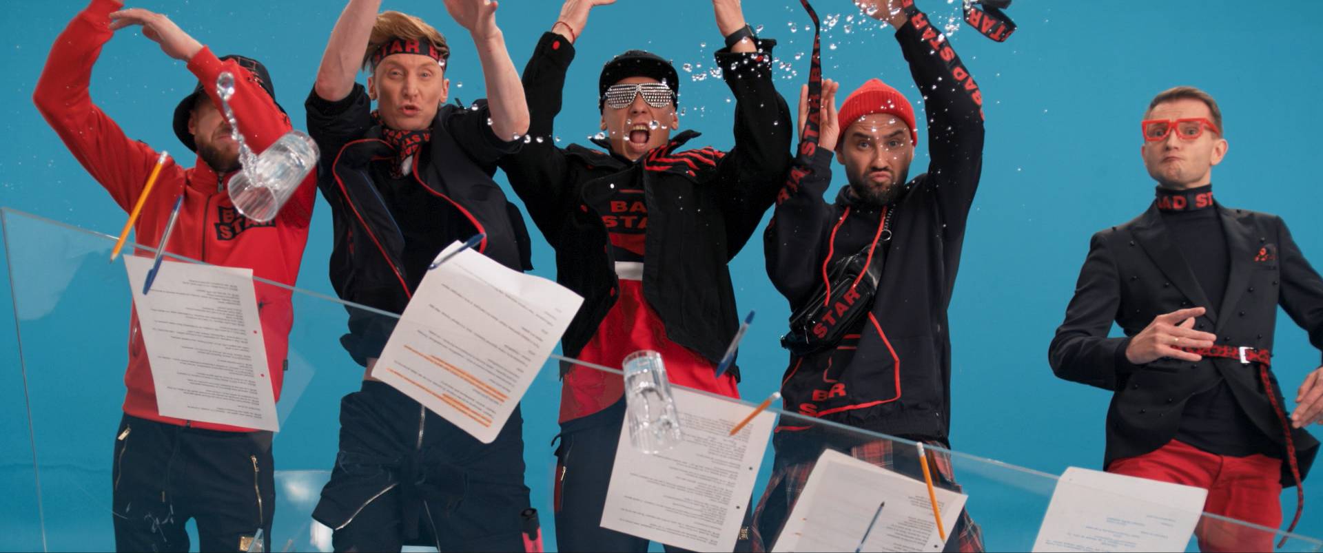
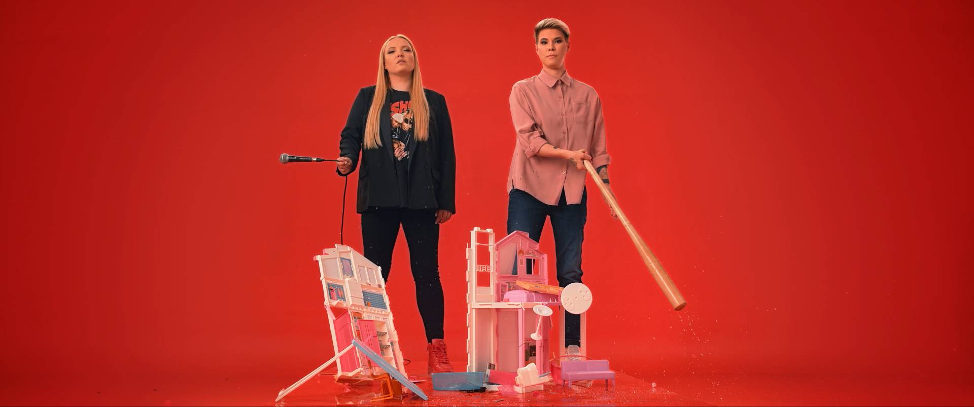
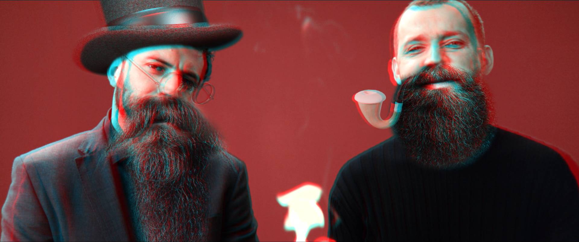
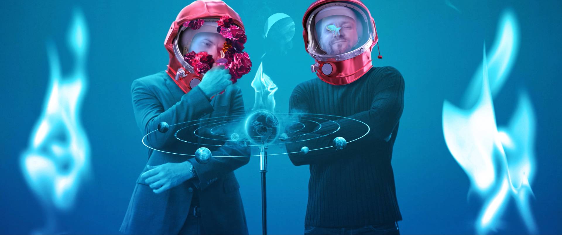
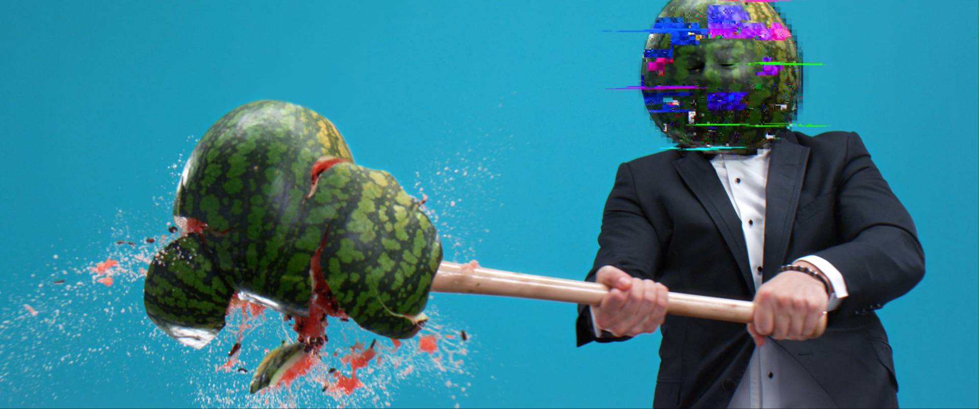

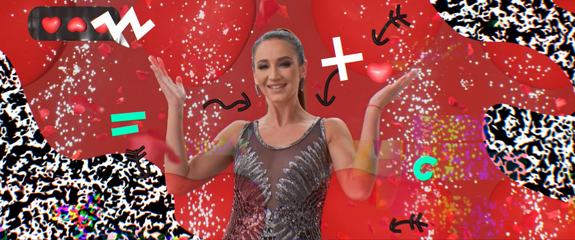
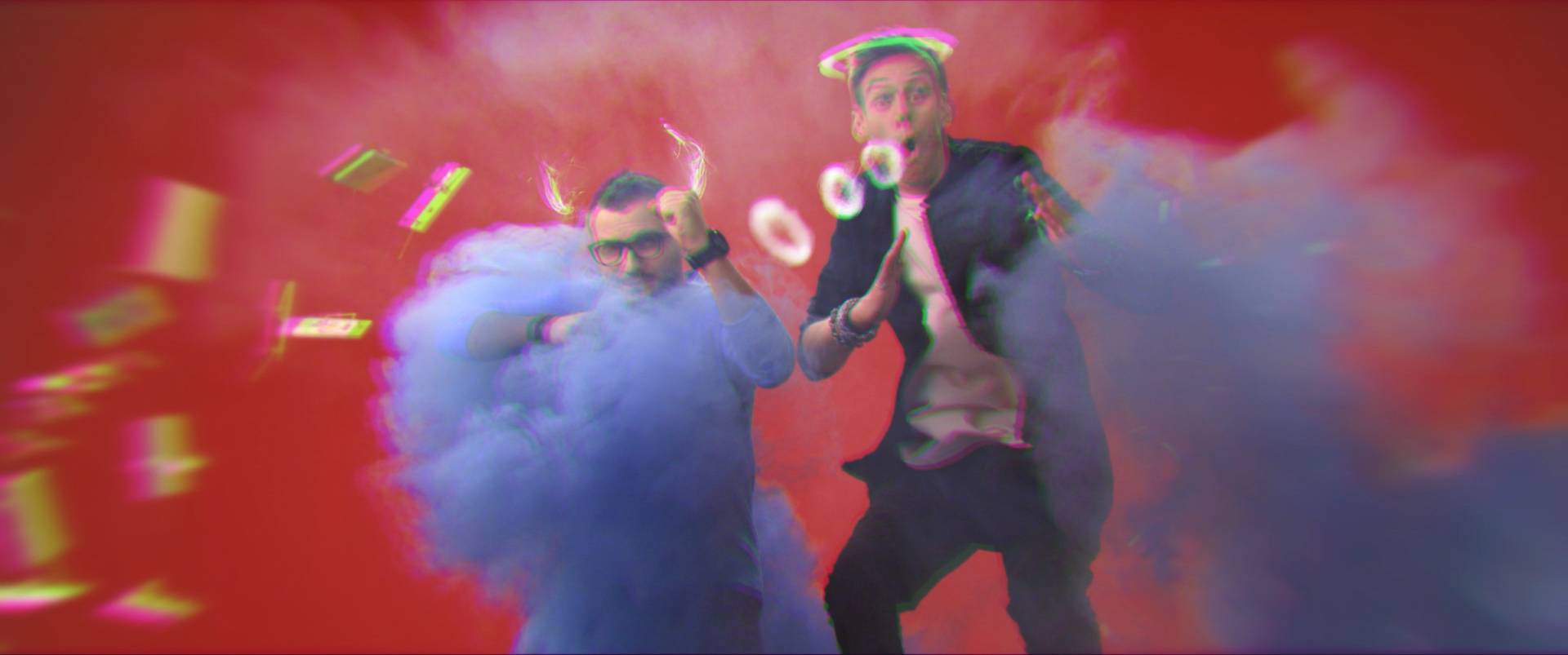
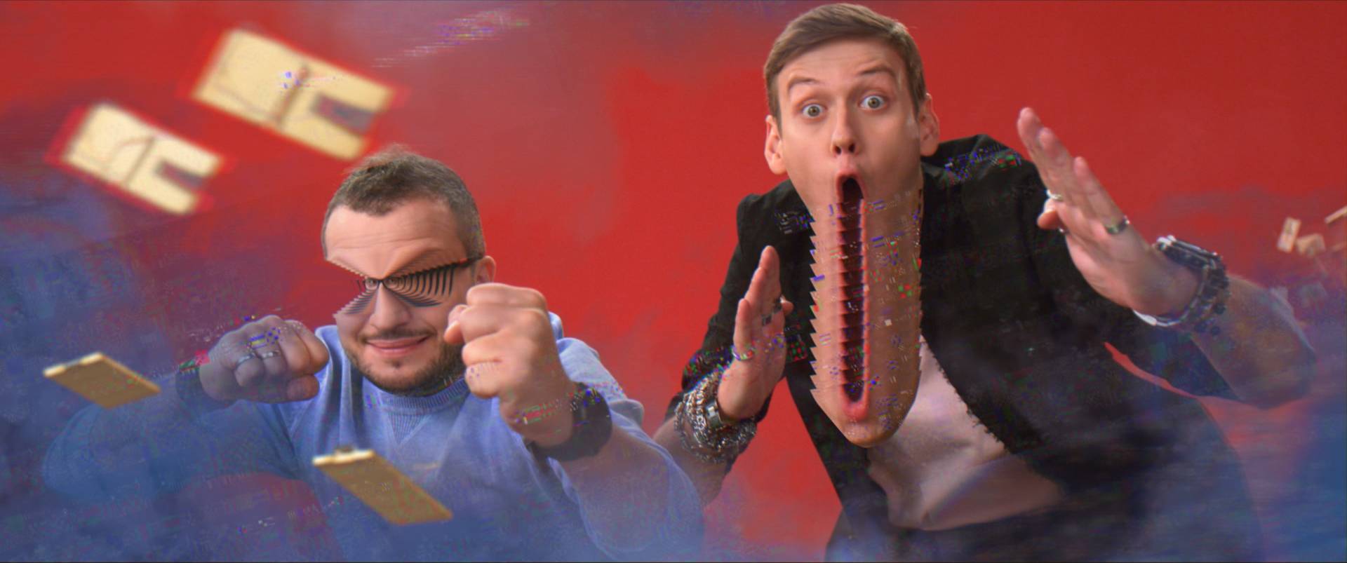
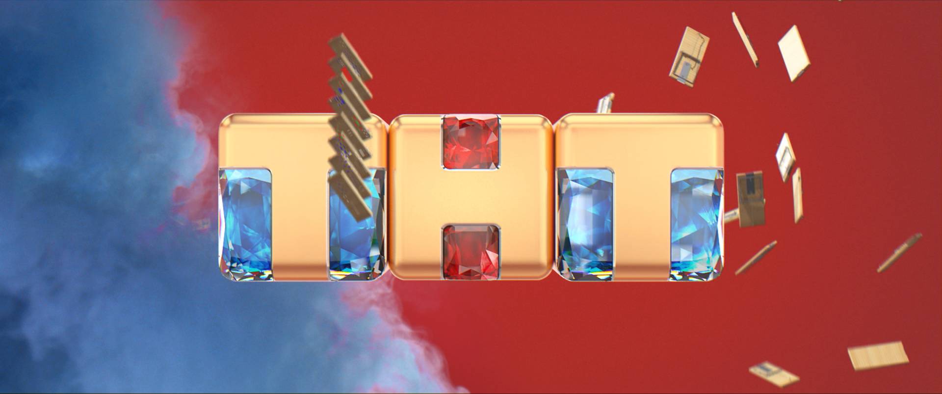
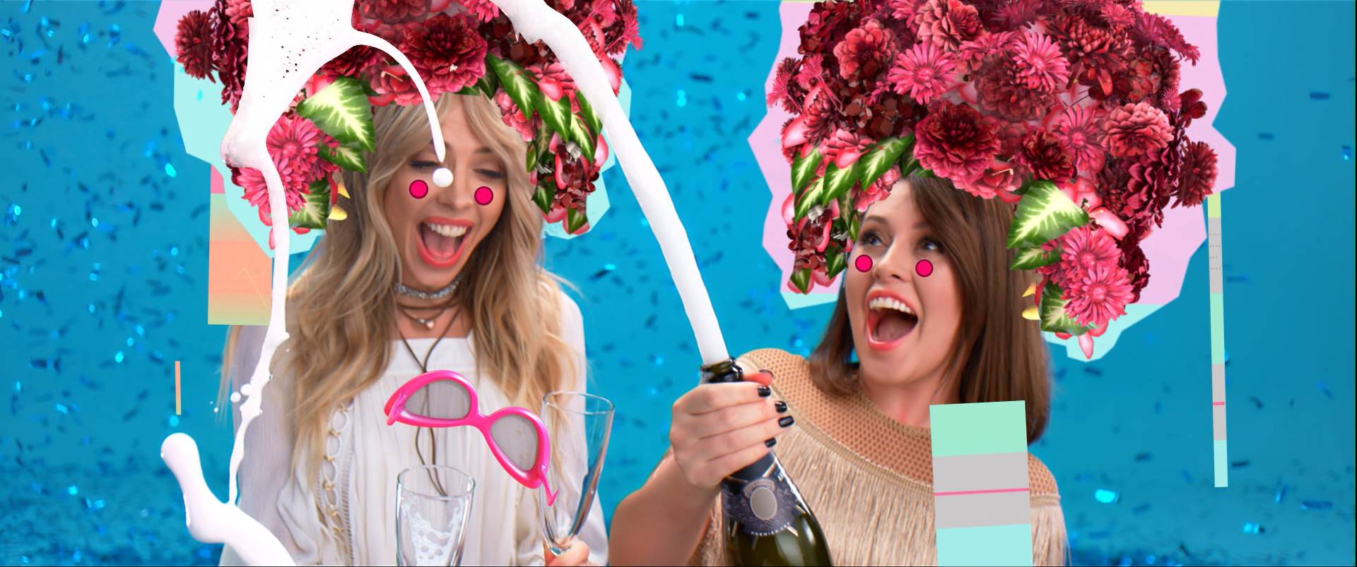
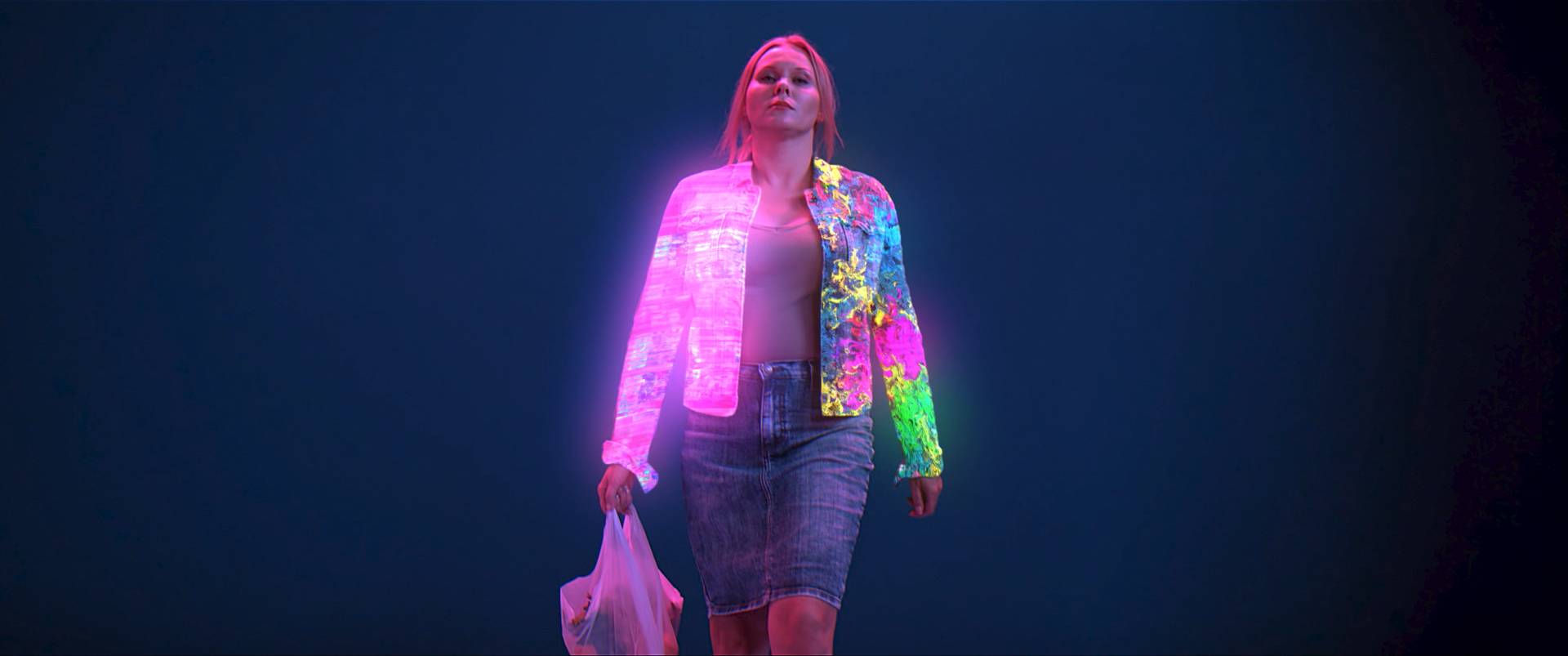
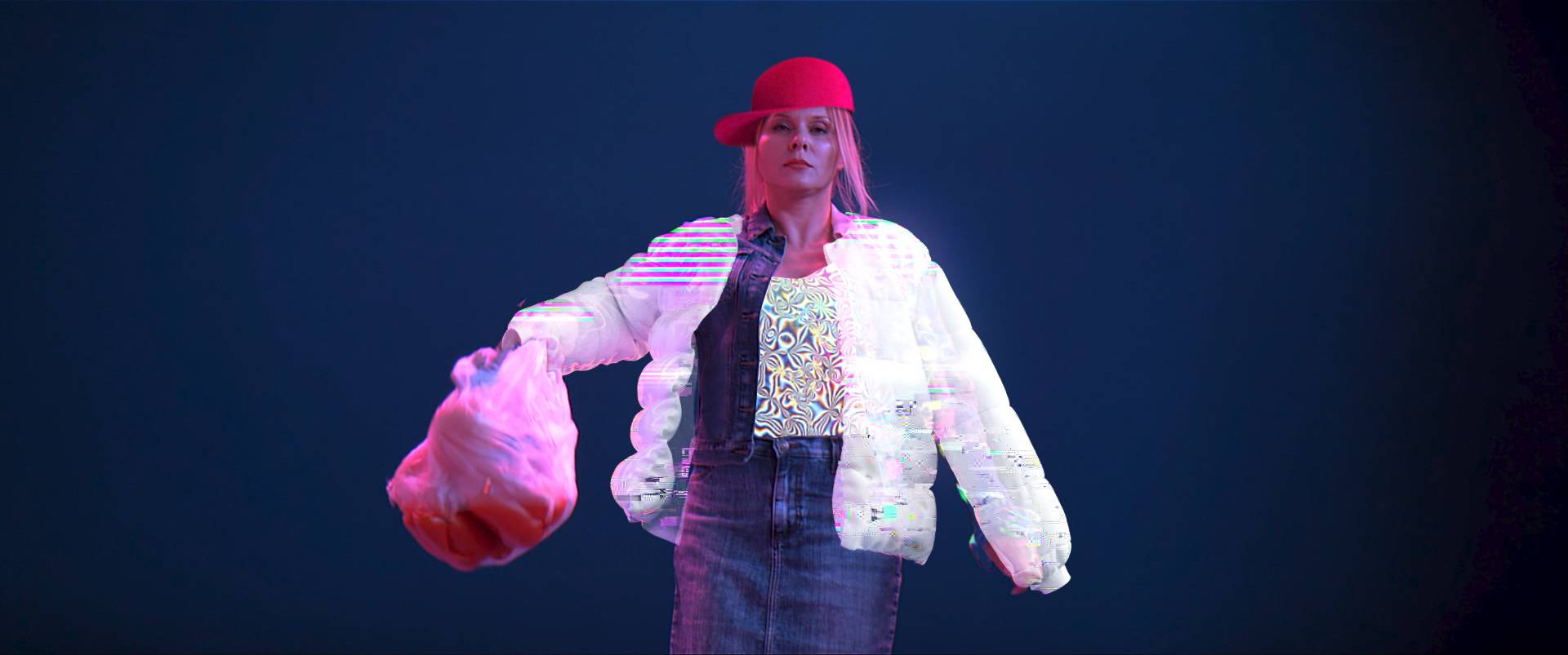
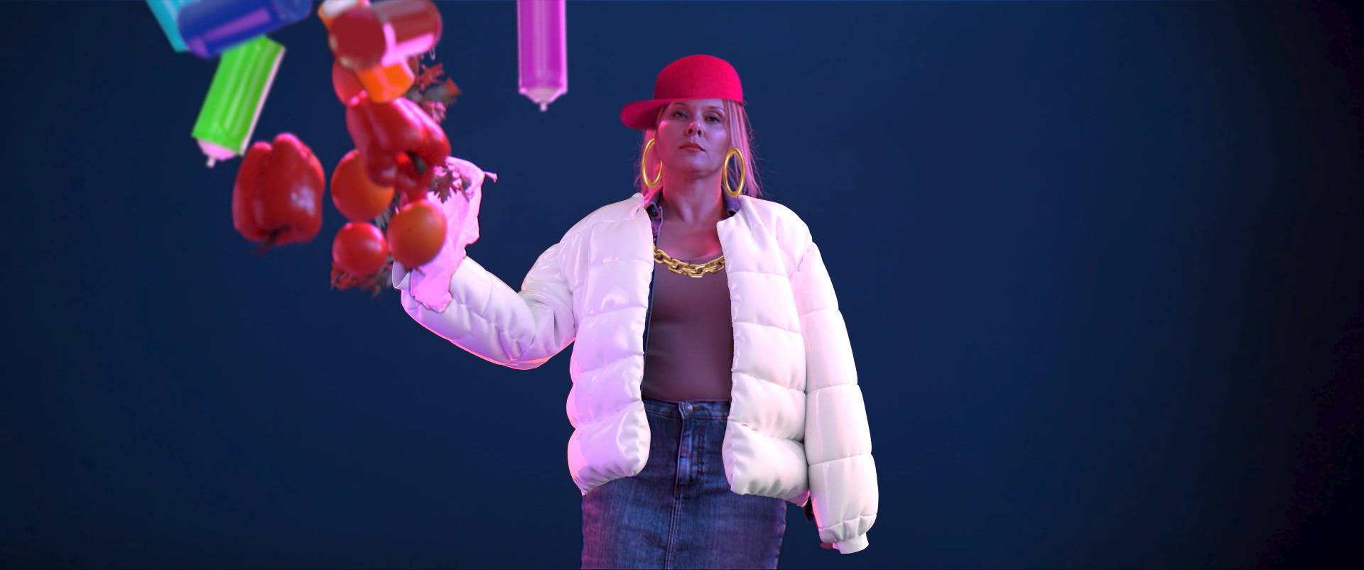
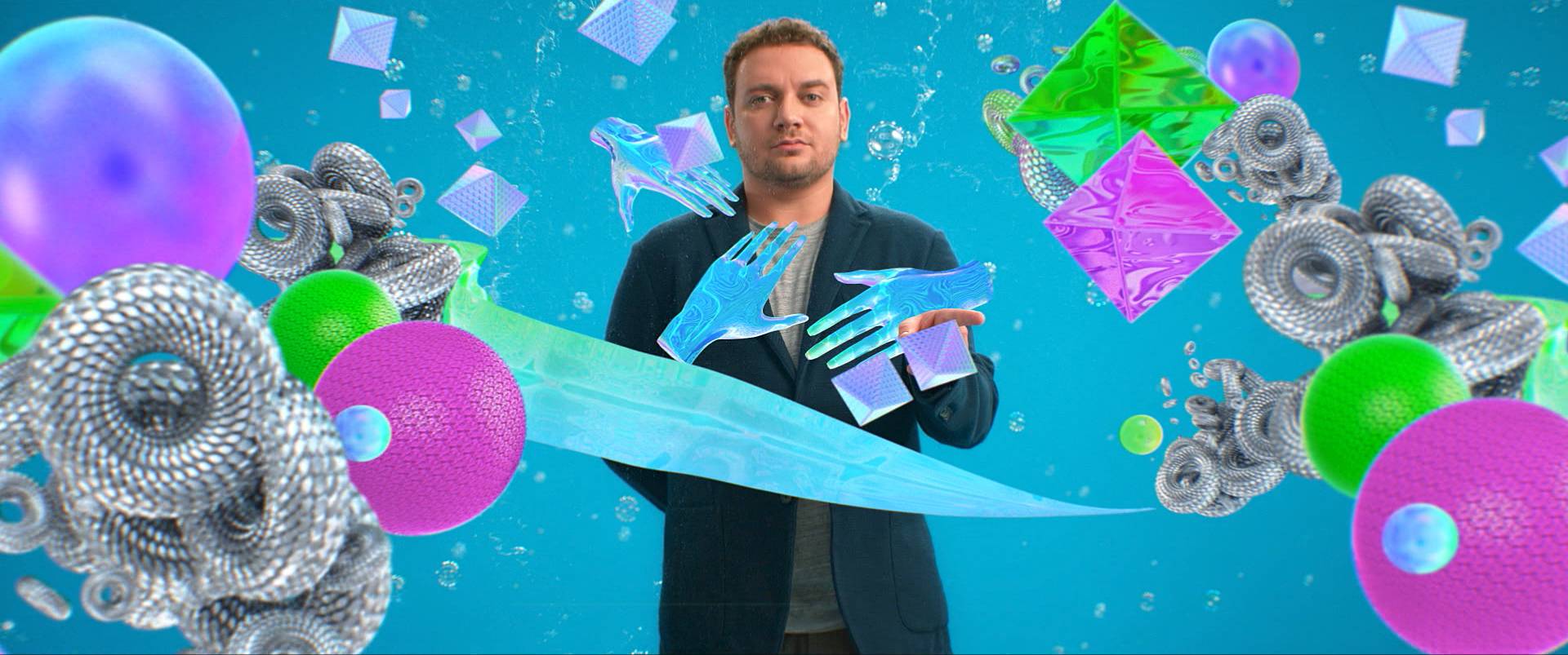
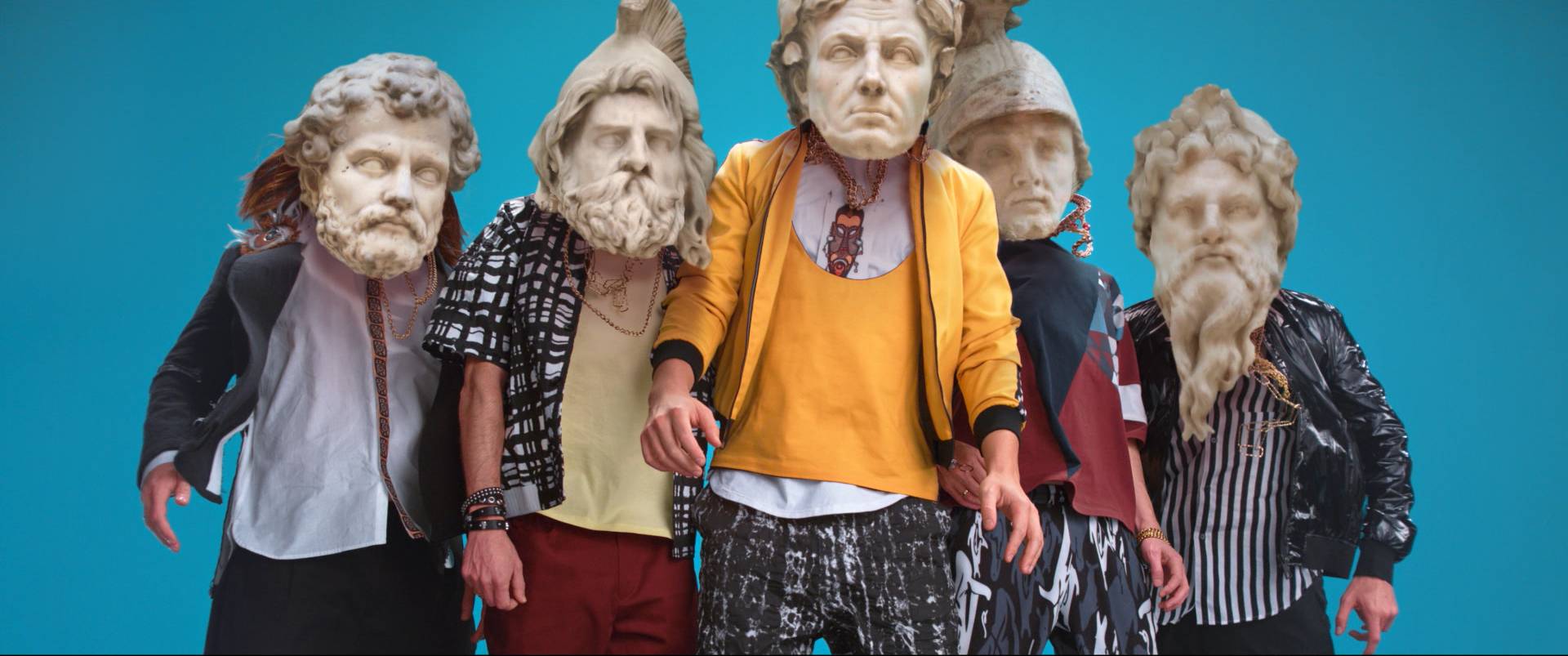
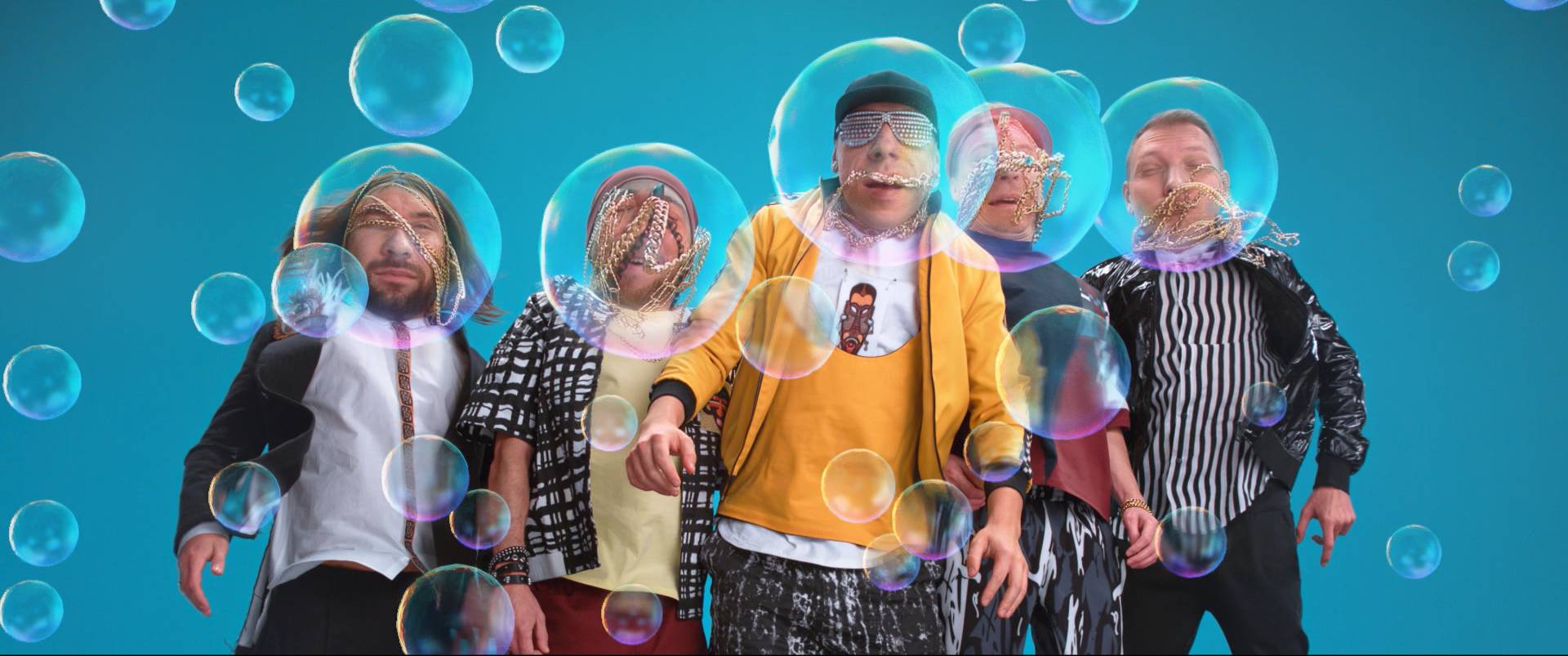
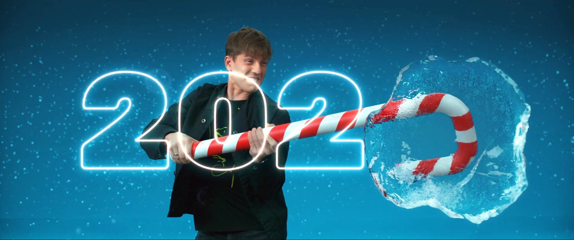
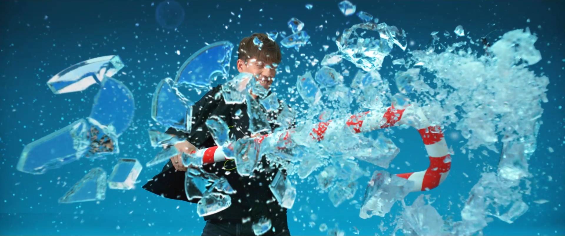
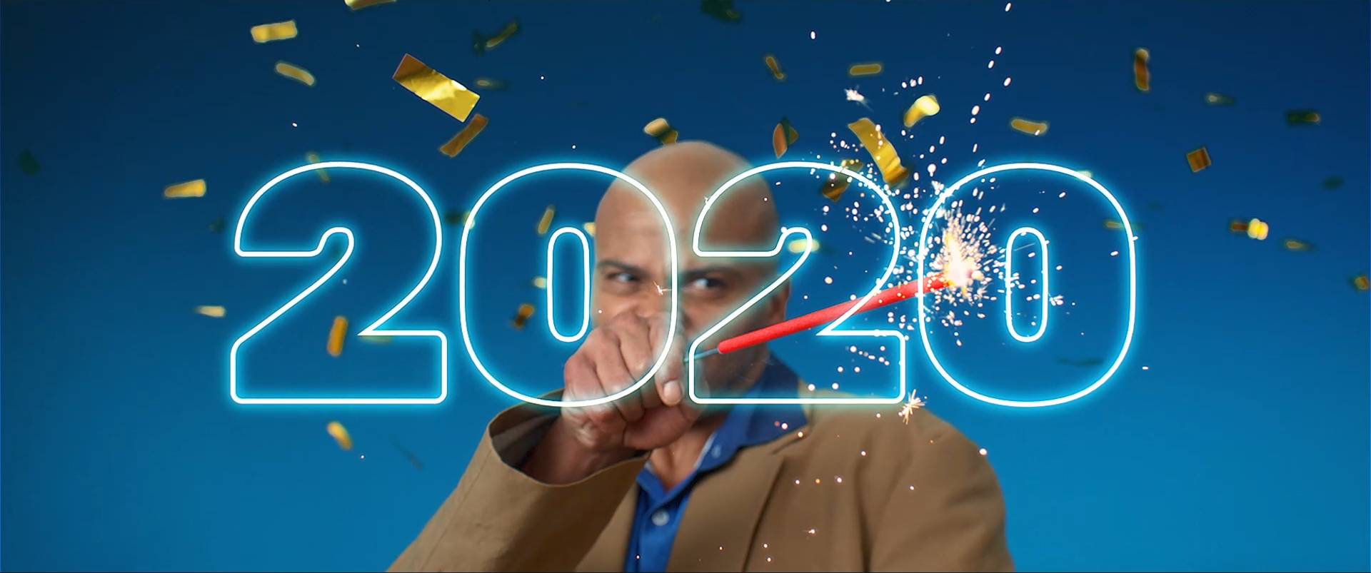
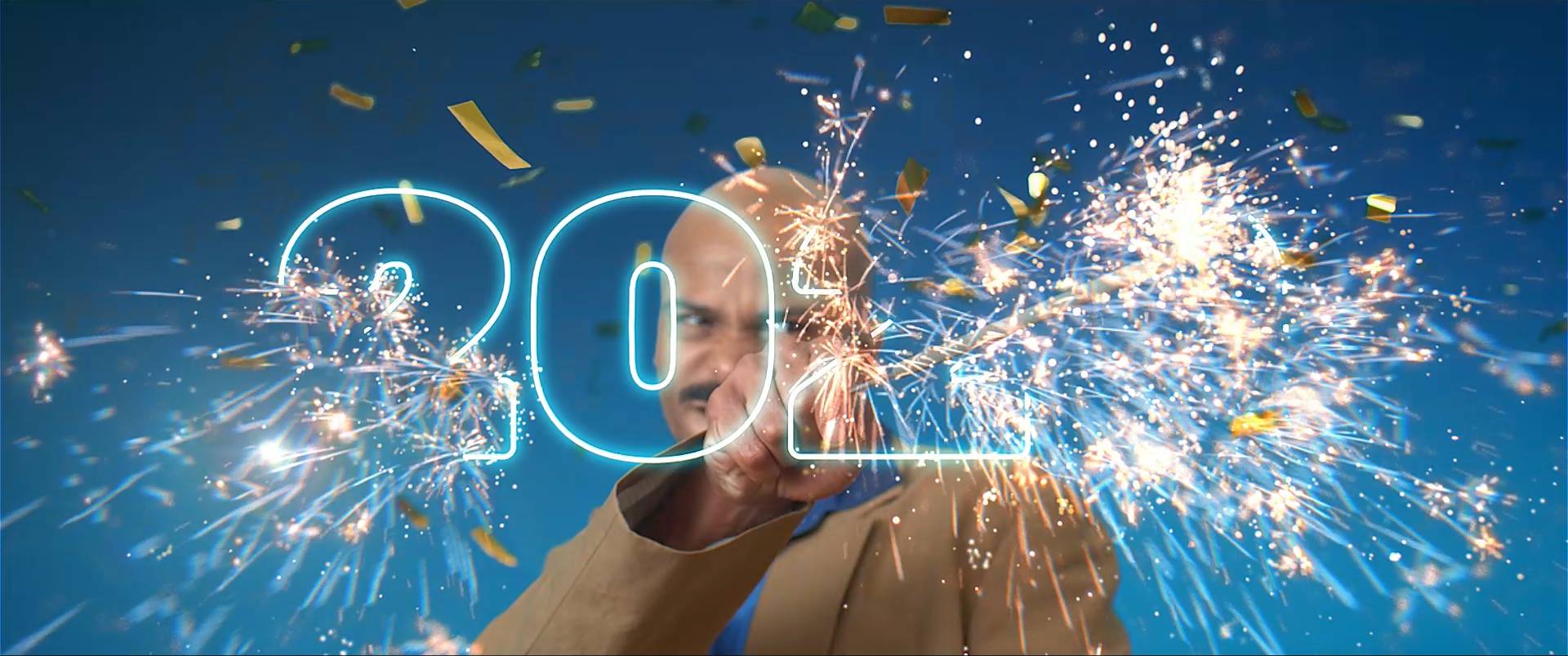
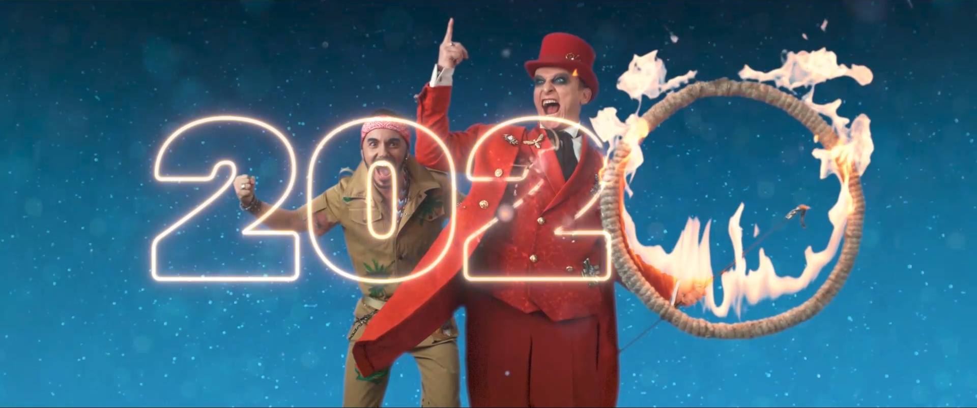
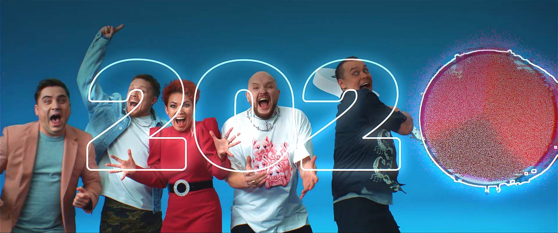
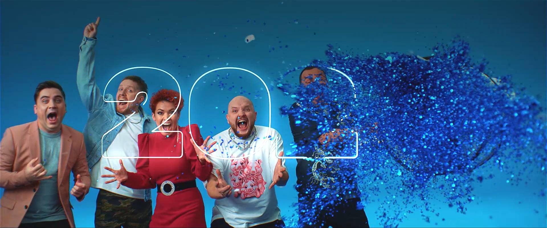
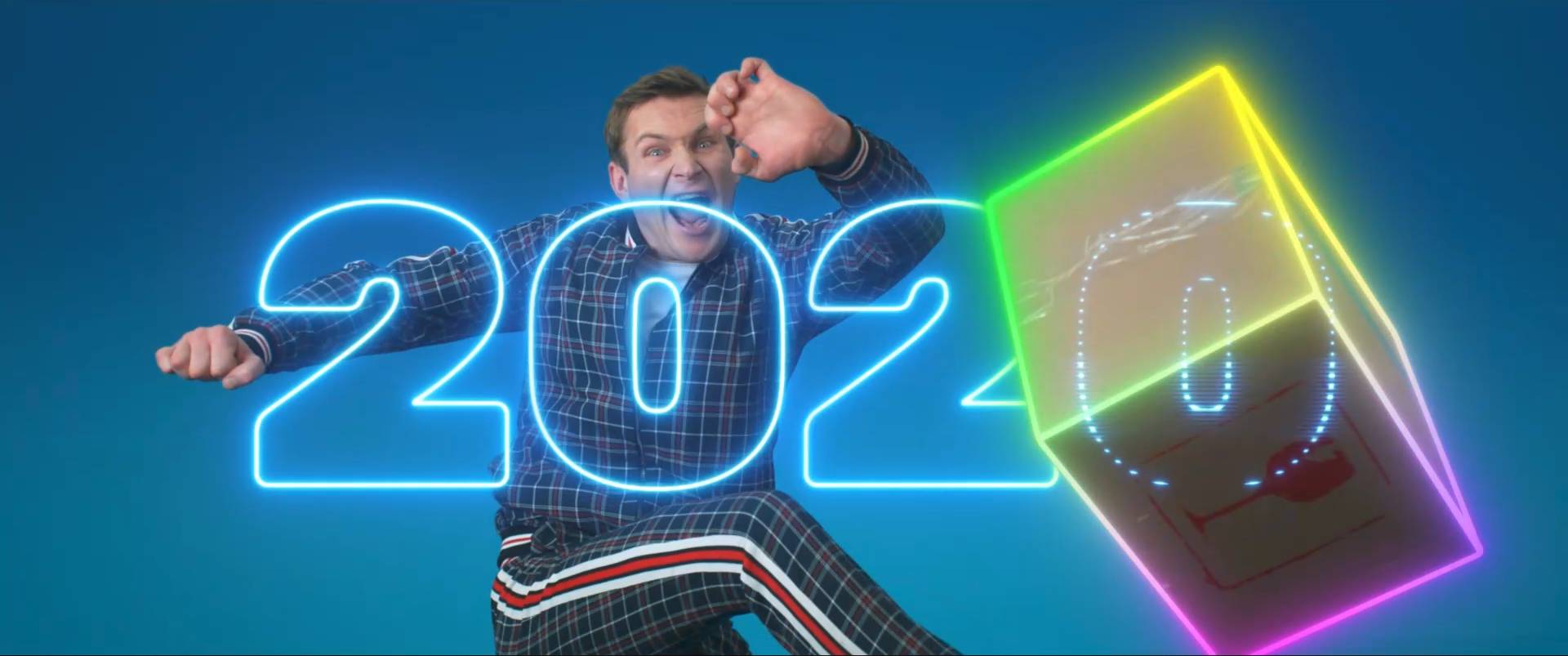
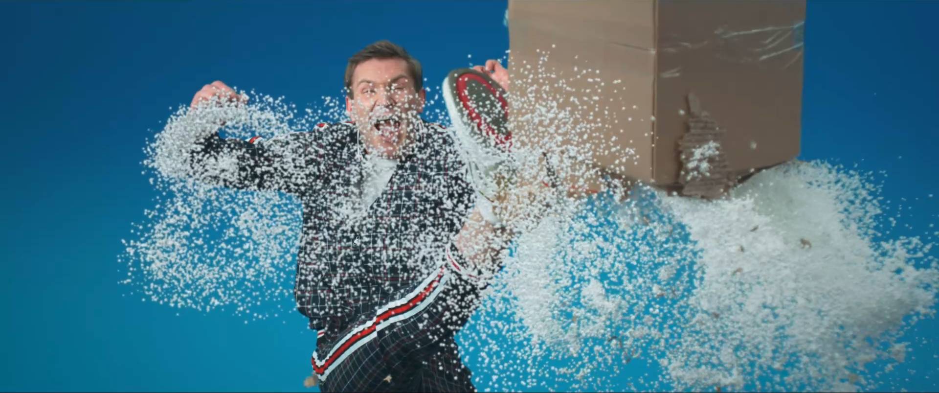
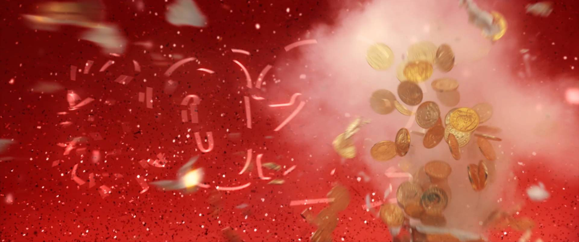
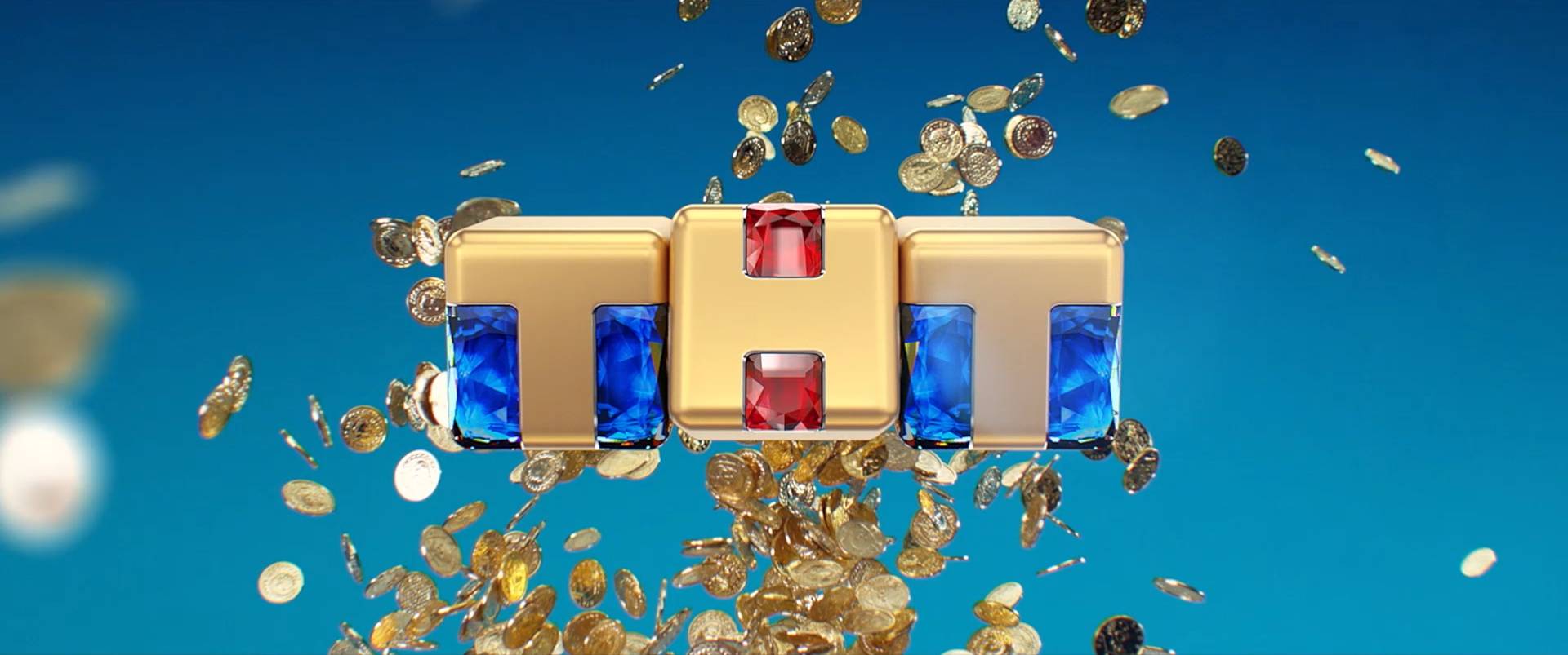
The other pivotal context in the promotion of our shows were the campaign key arts.
We gave discipline to the design of our campaigns, with the introduction of a grid and the redefinition of some design processes — to increase the sinergy between creatives, graphic designers, photographer, photo retoucher and post producers.
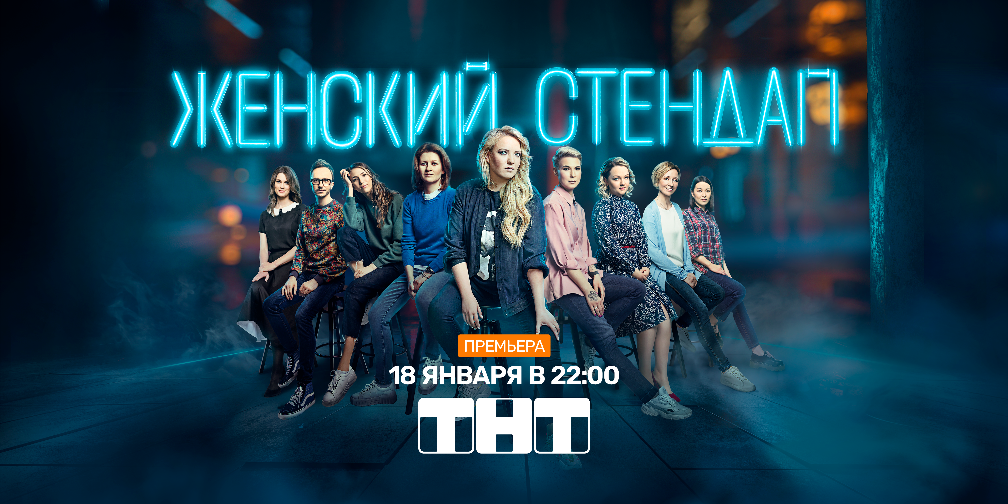
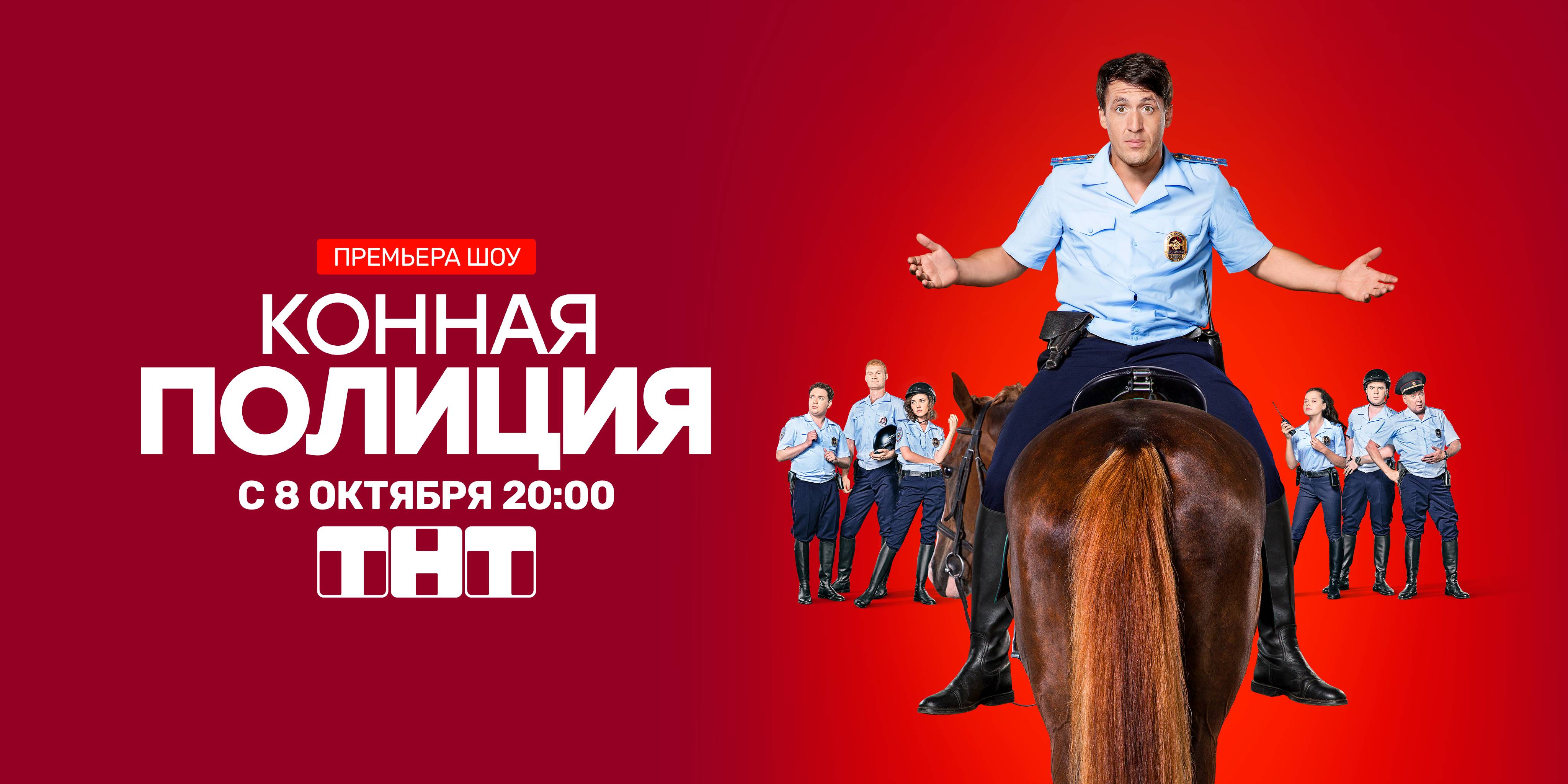
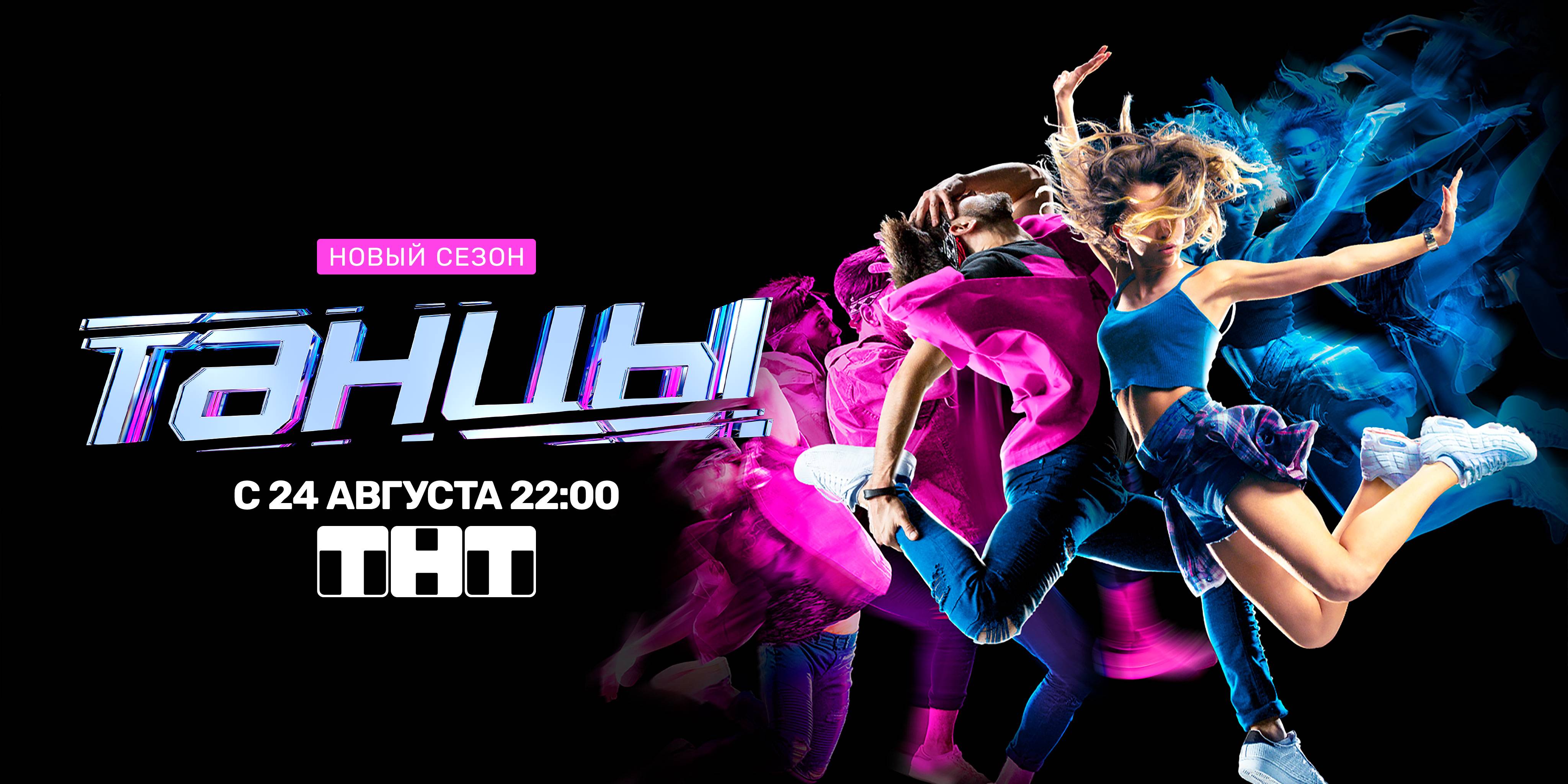
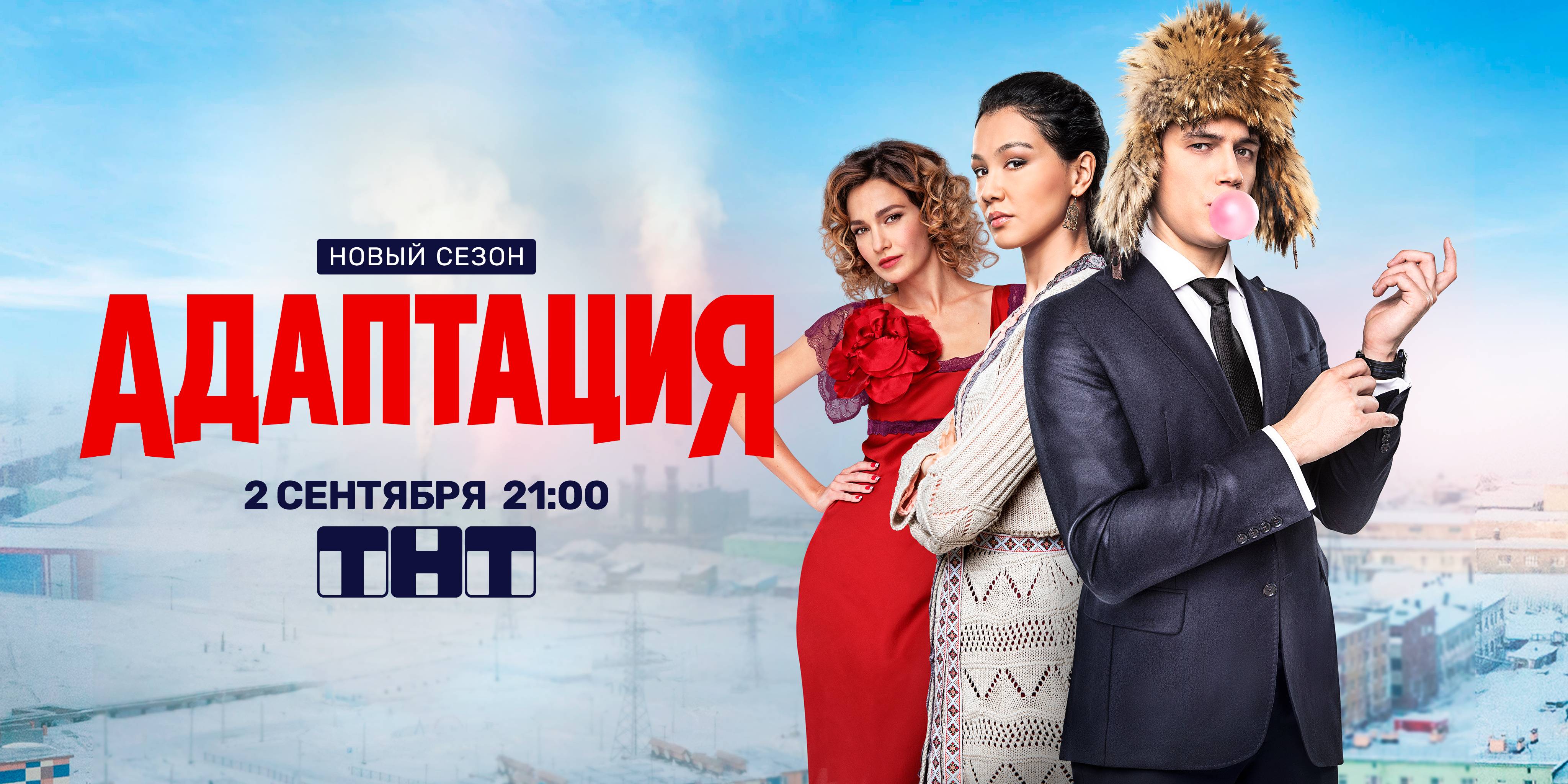
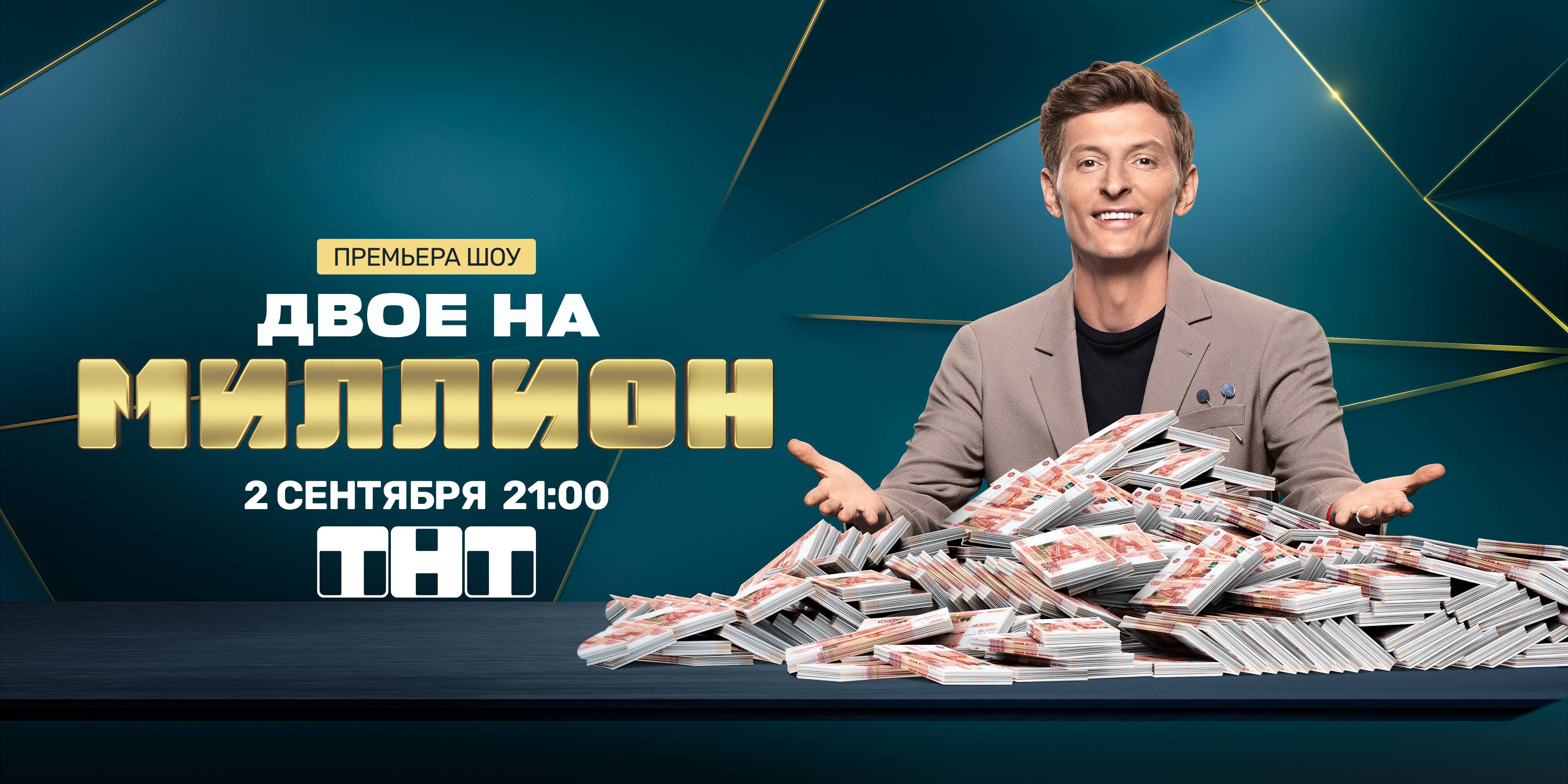
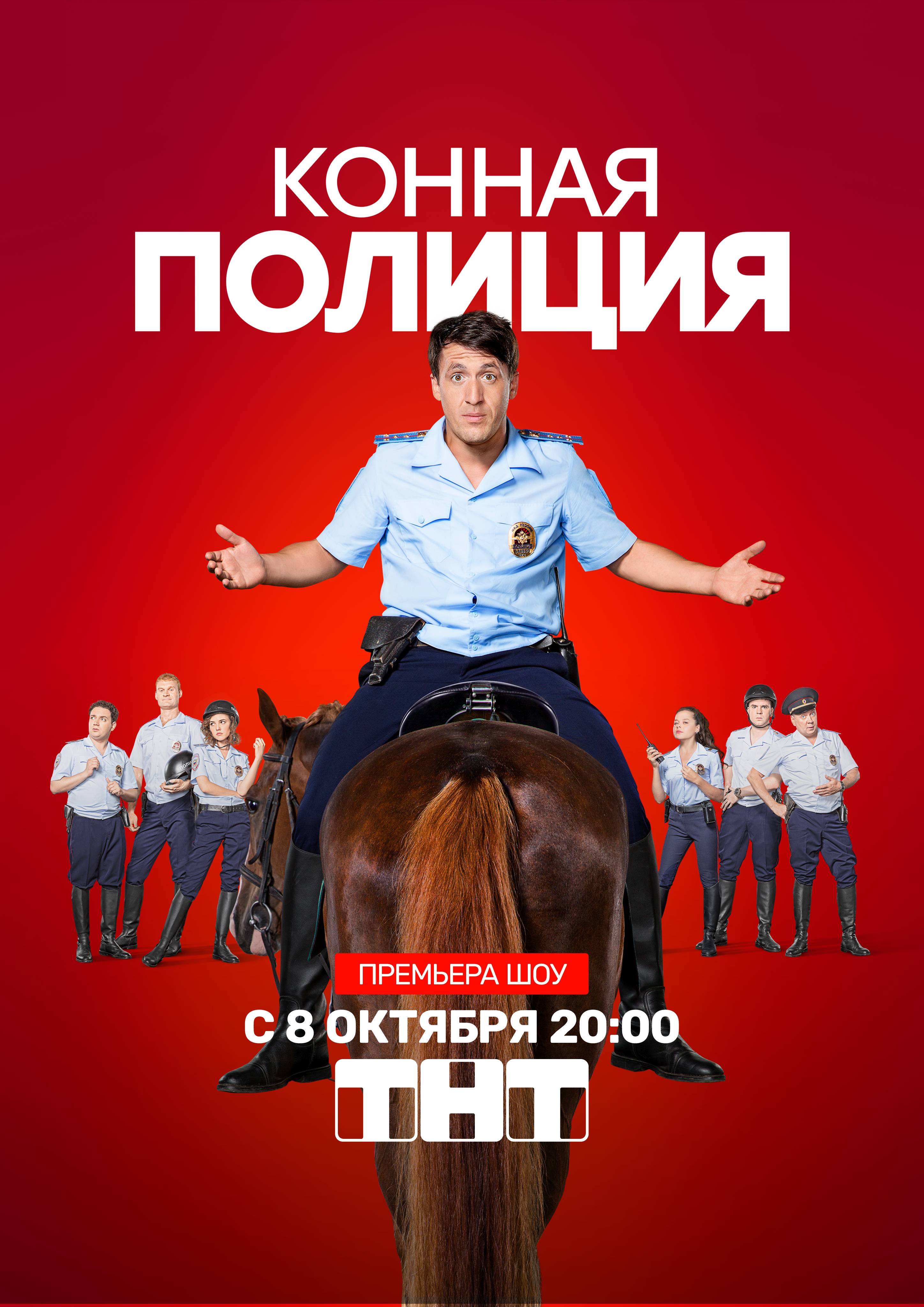
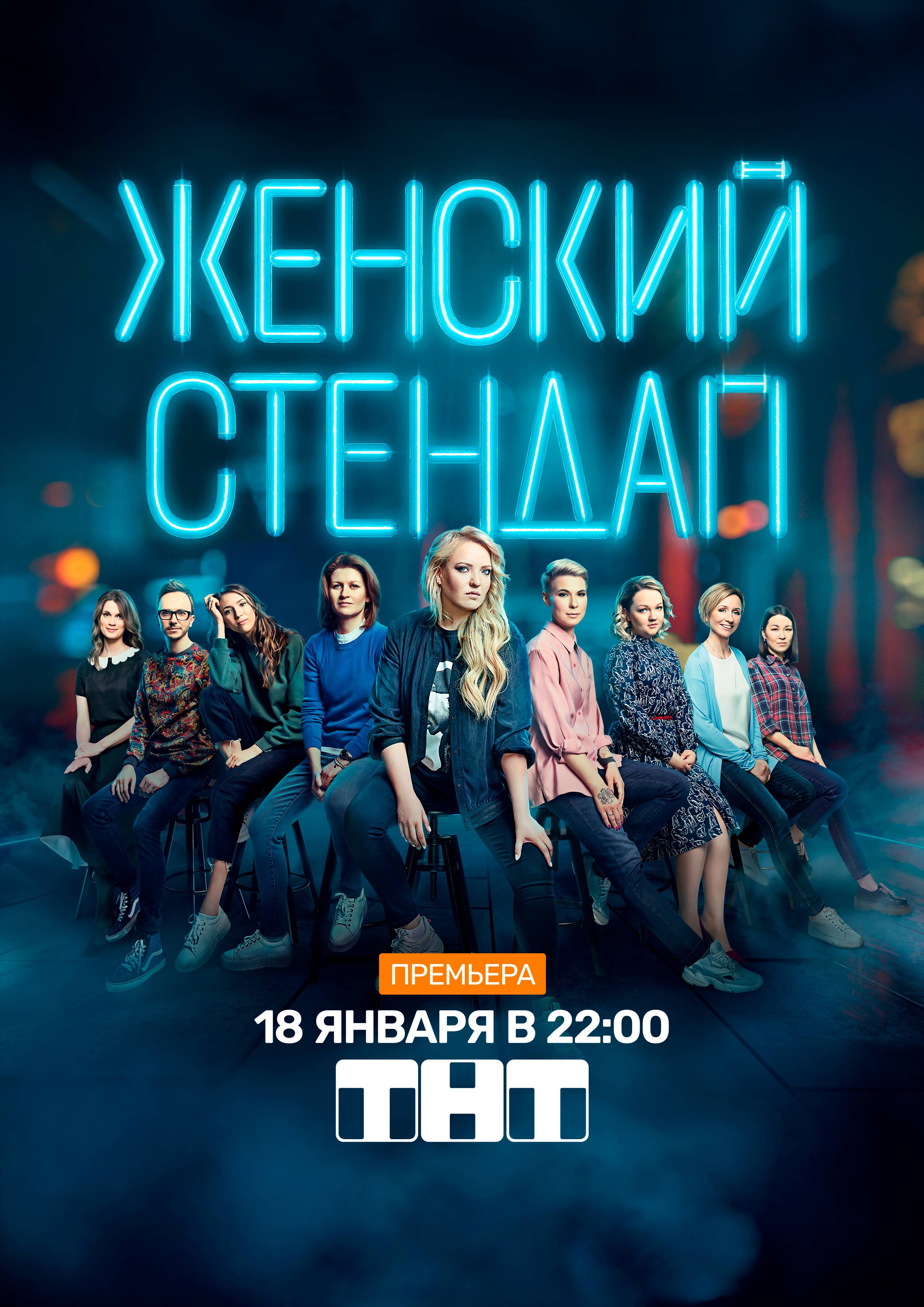
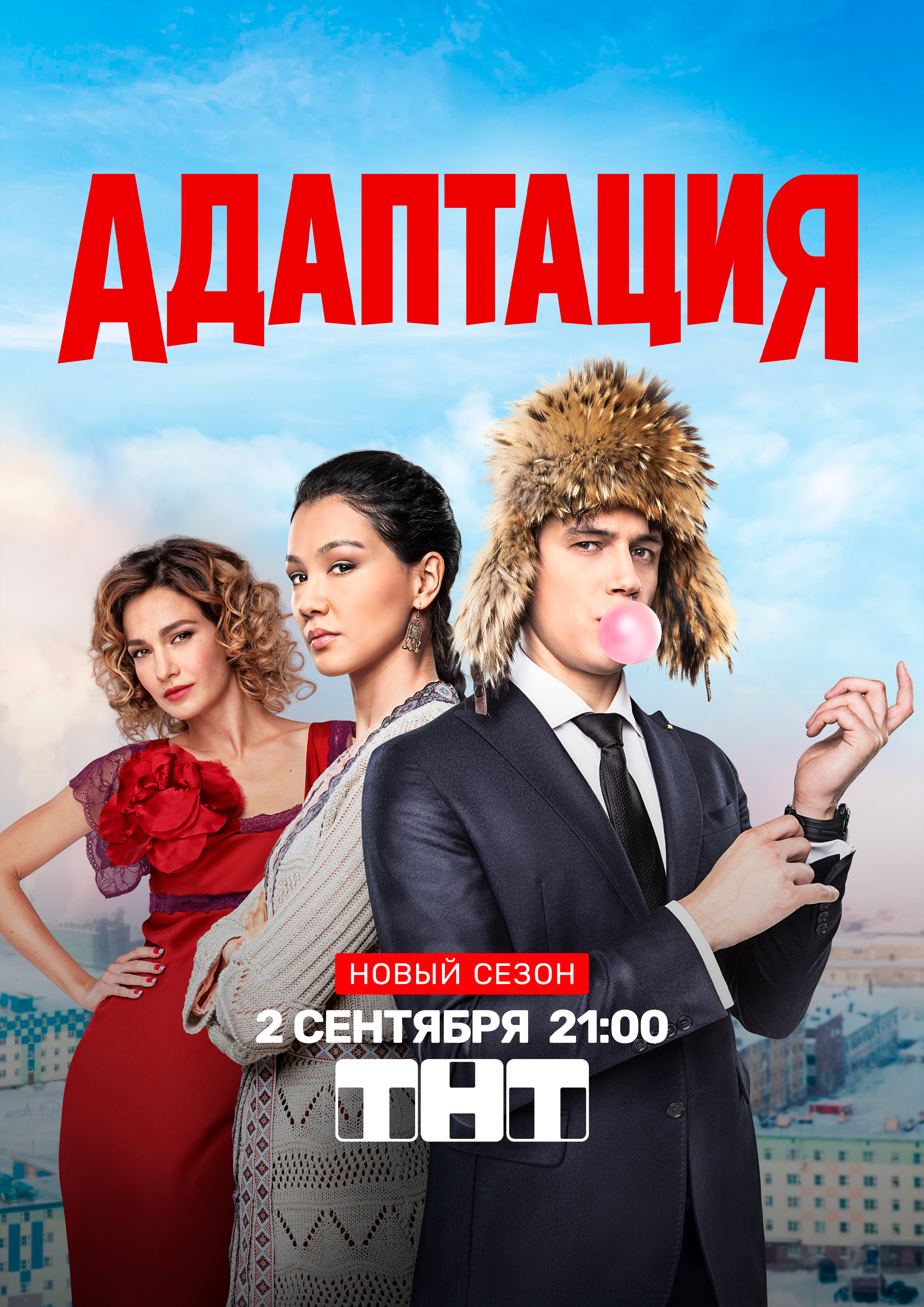
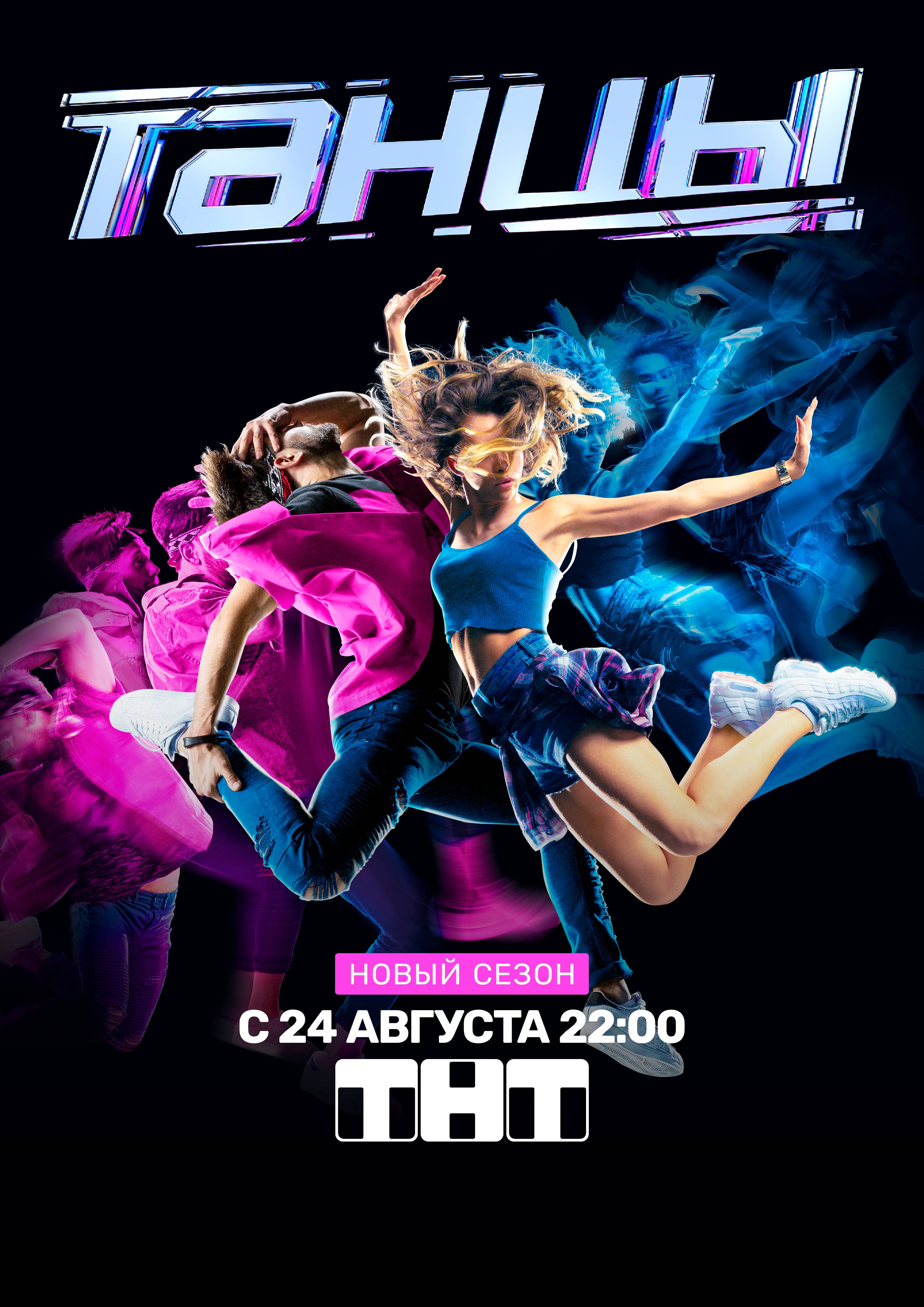
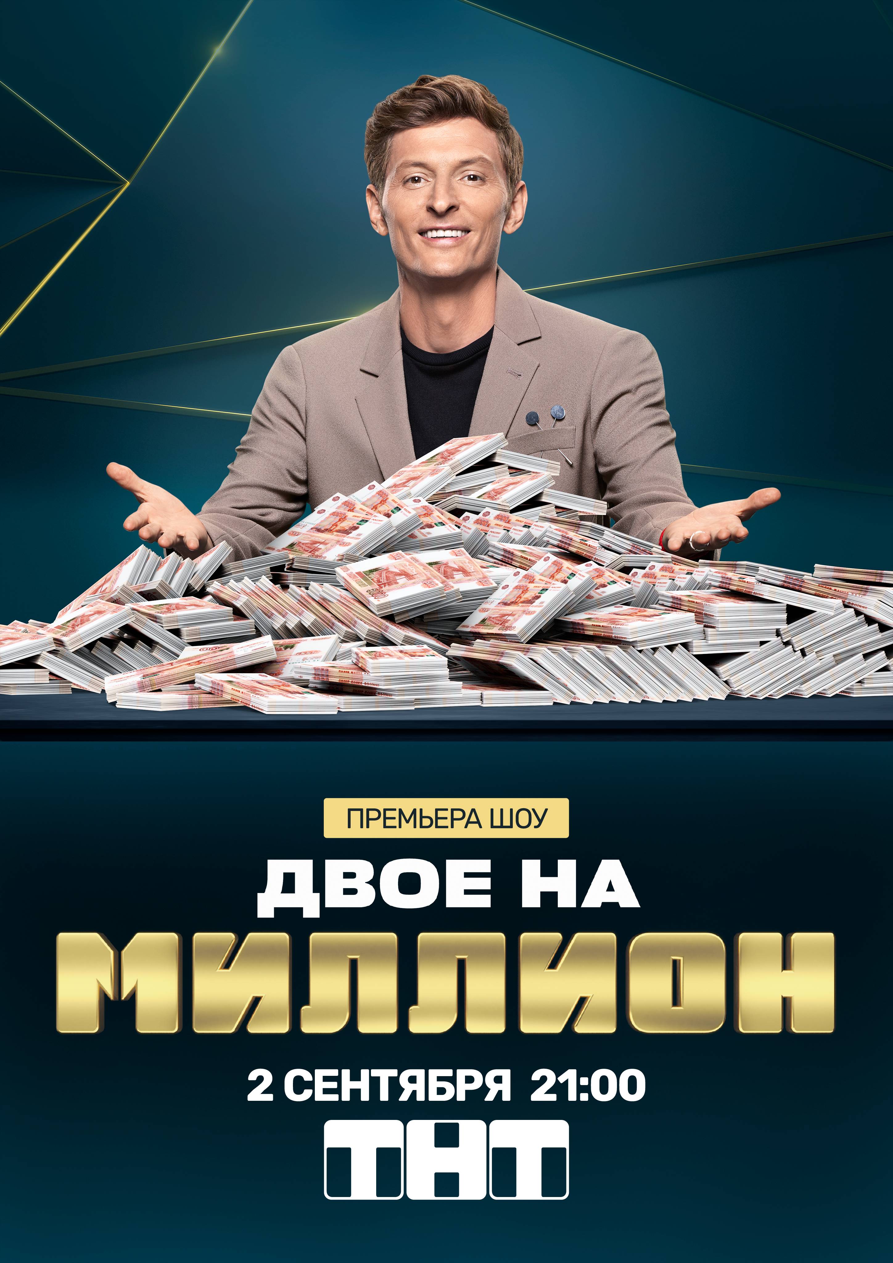
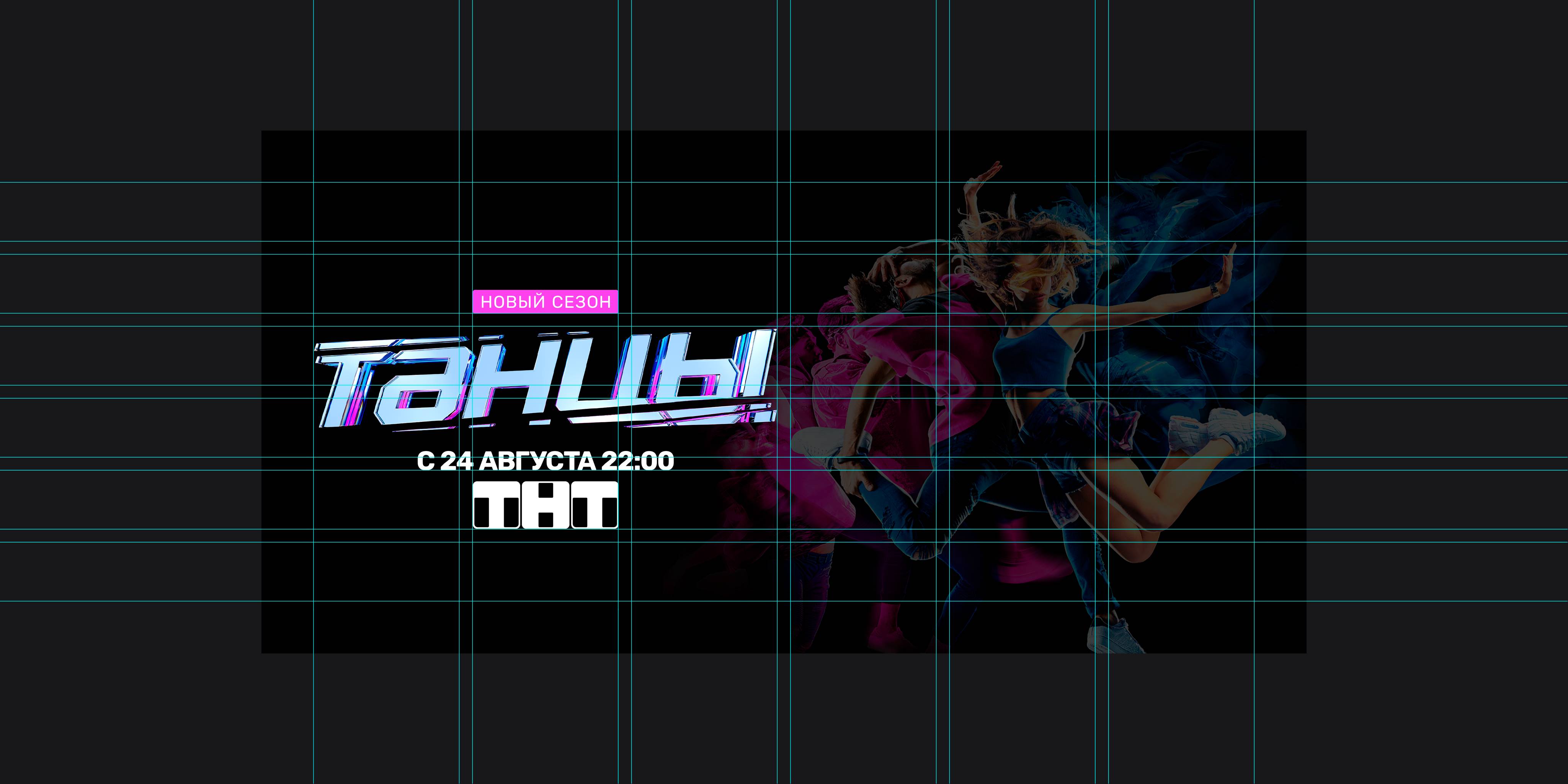
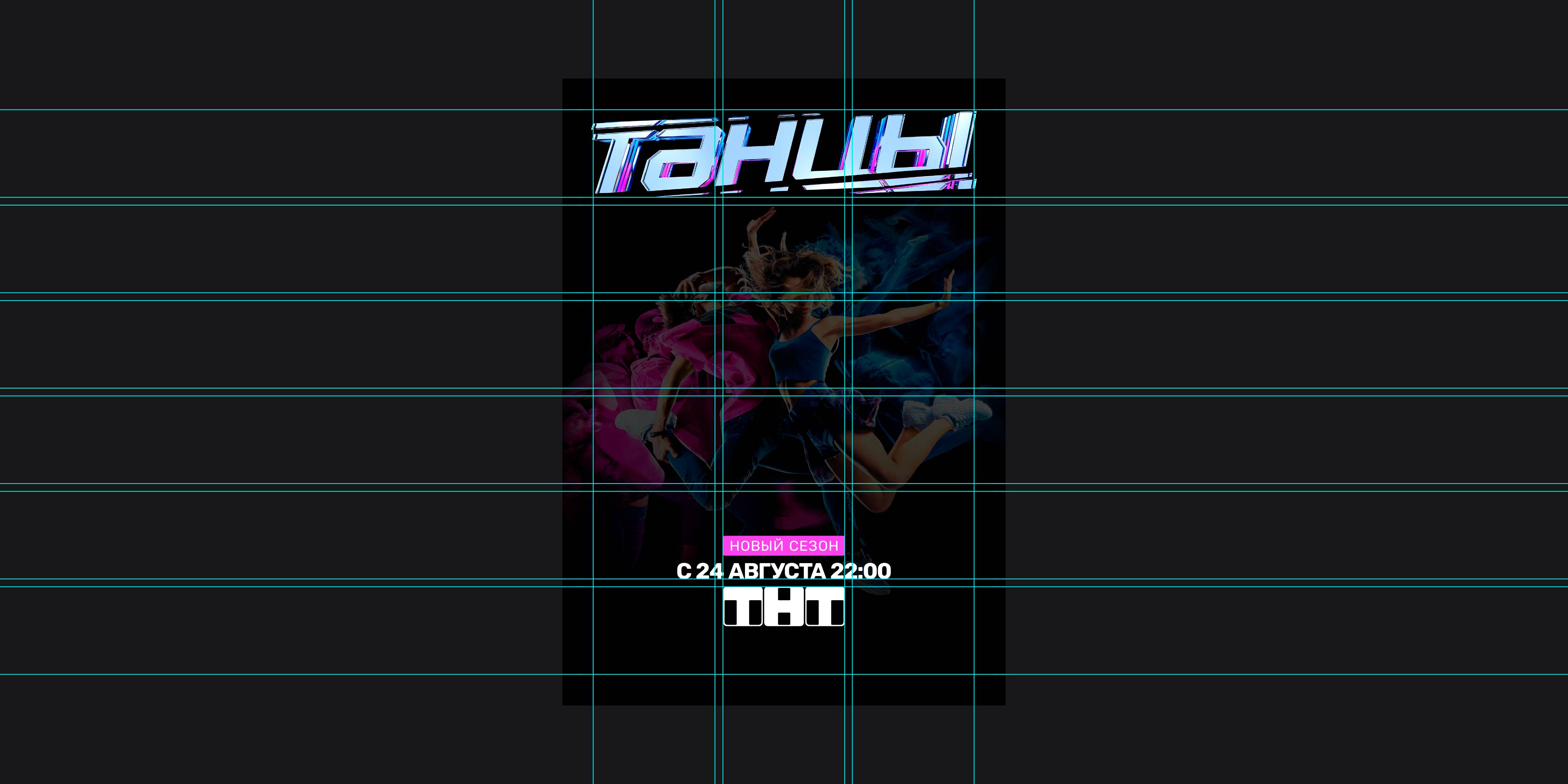
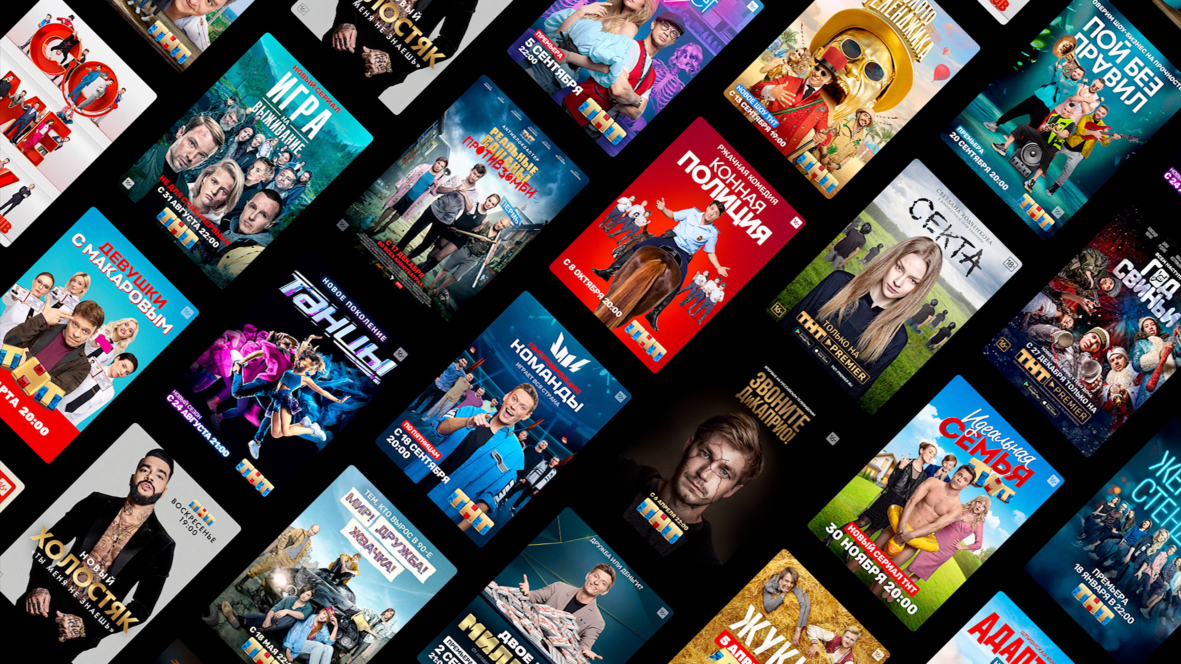
This simple yet effective approach, saw a constant upwards trend in the following 3 years — as shown by the huge (yet limited!) amount of campaigns here below.
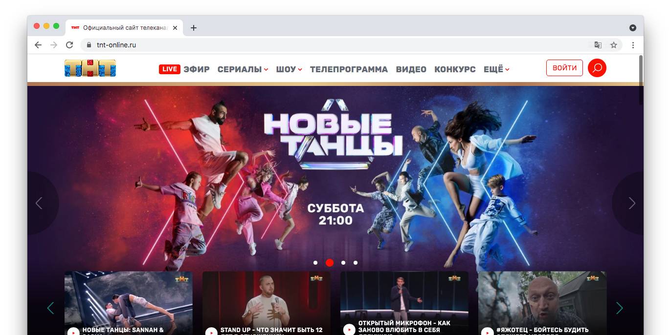
Finally, it was the time to re-vitalize our online presence through a fully redesigned website and a new social media toolkit.
Finally, the redesign process involved the definition of a new benchmark for the packaging of our show. Here below some examples.
TNT Design
TNT Marketing
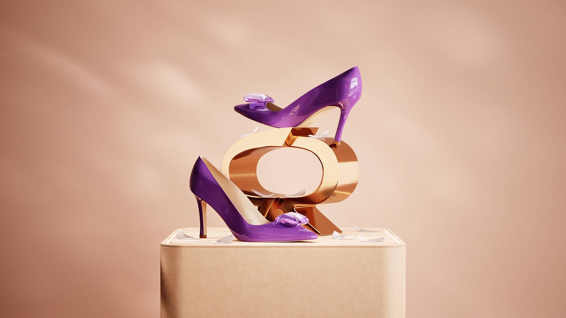
Celebrating Chinese St. Valentine’s Day with the launch of a limited edition of the iconic shoe.
View Project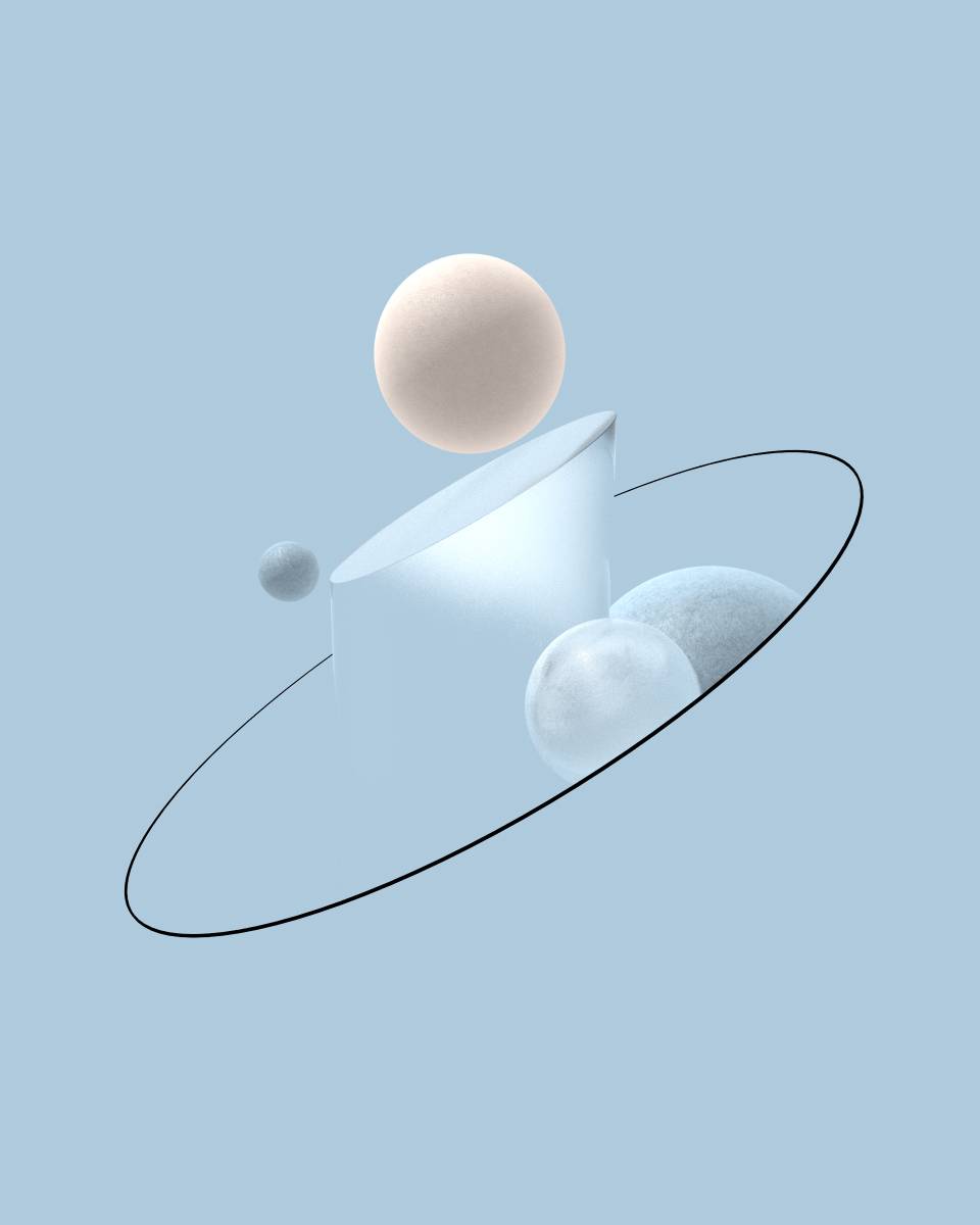
Animated digital illustrations for Wellness Holding website.
View Project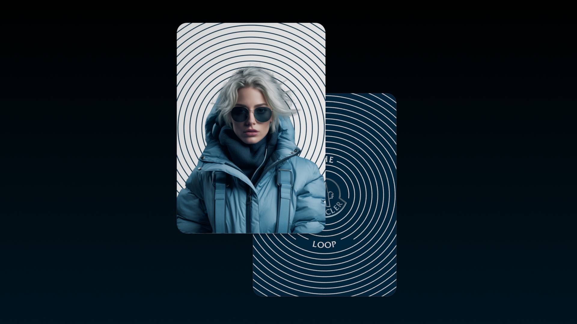
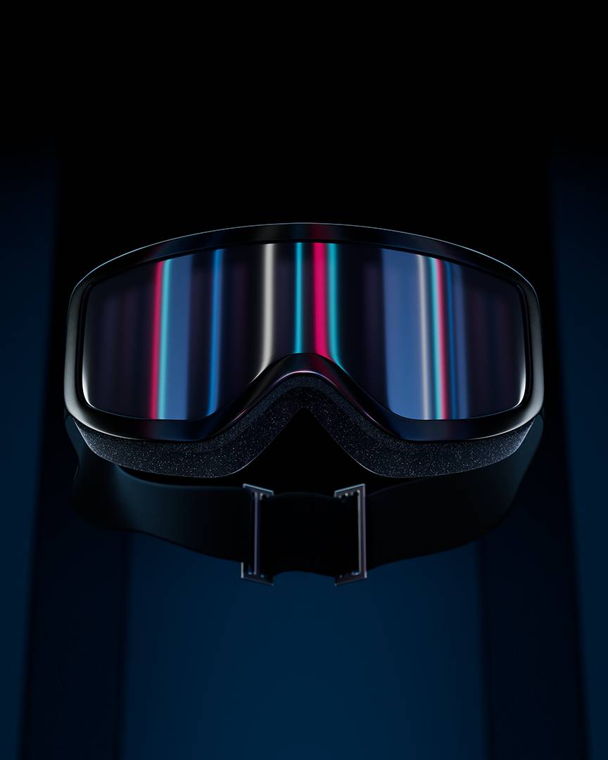
Supporting the rollout of a B2B software, empowering Moncler store managers and sales departments worldwide.
View Project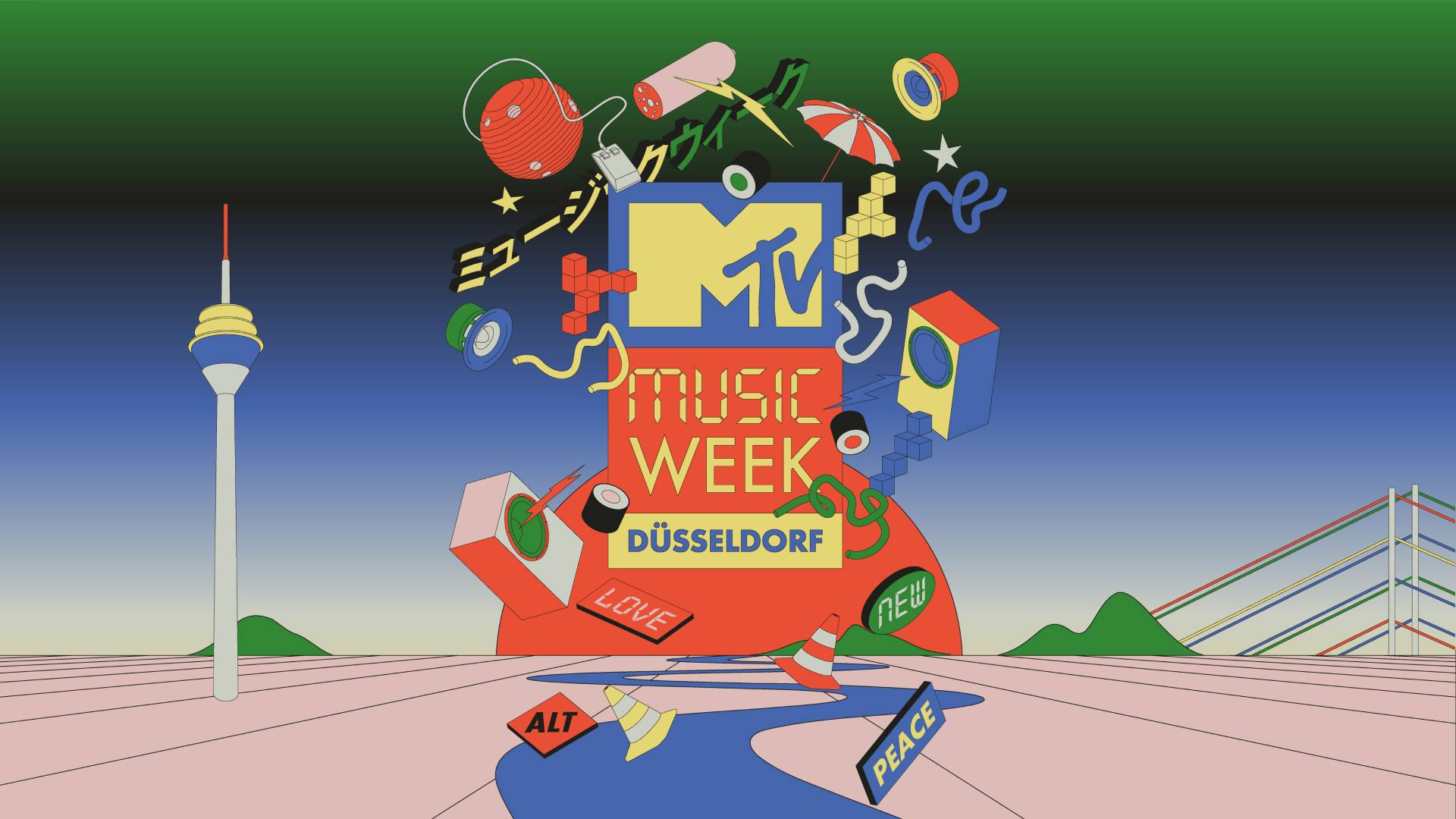
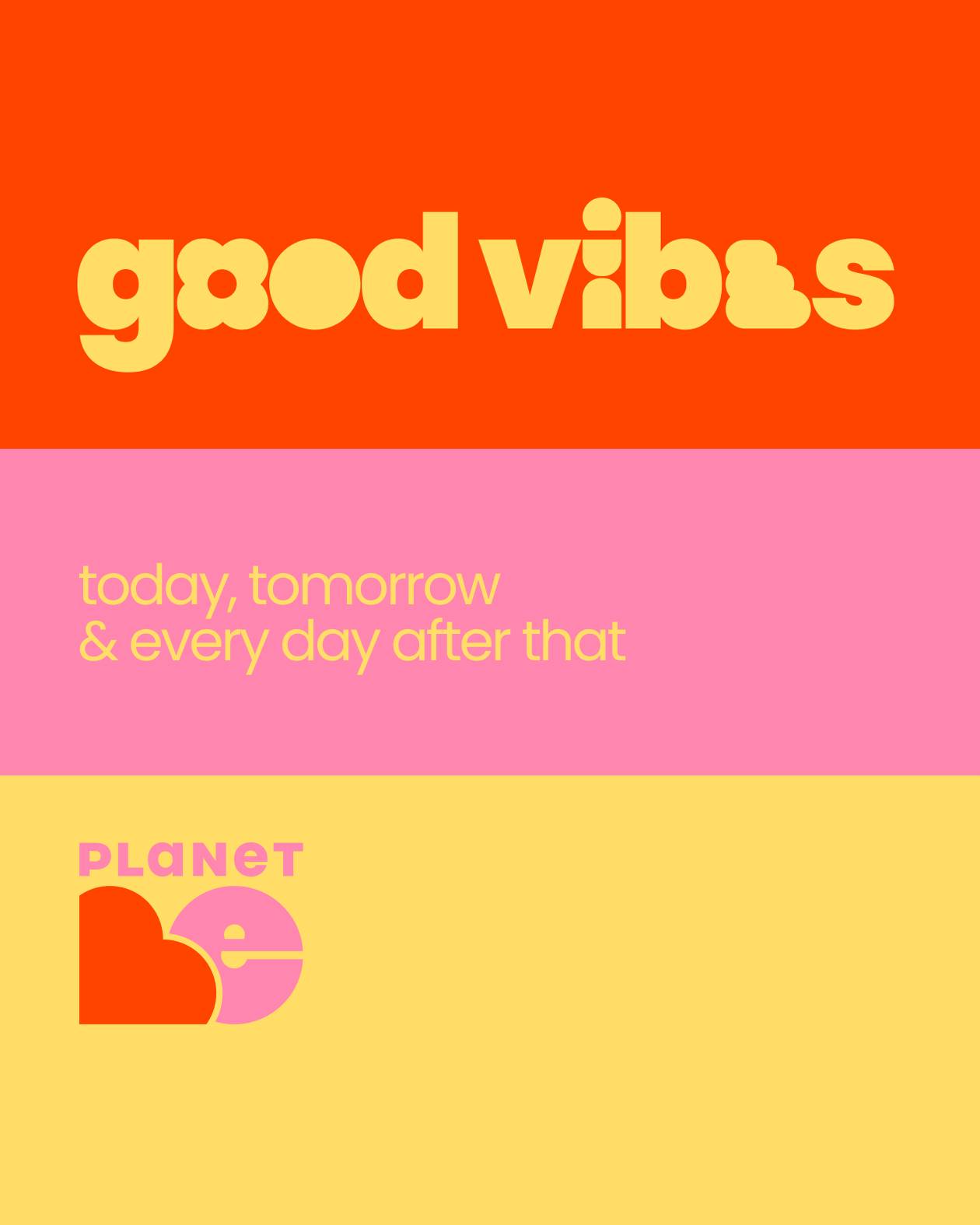
Identity for a social-media first climate change awareness campaign by Connect4Climate
View Project
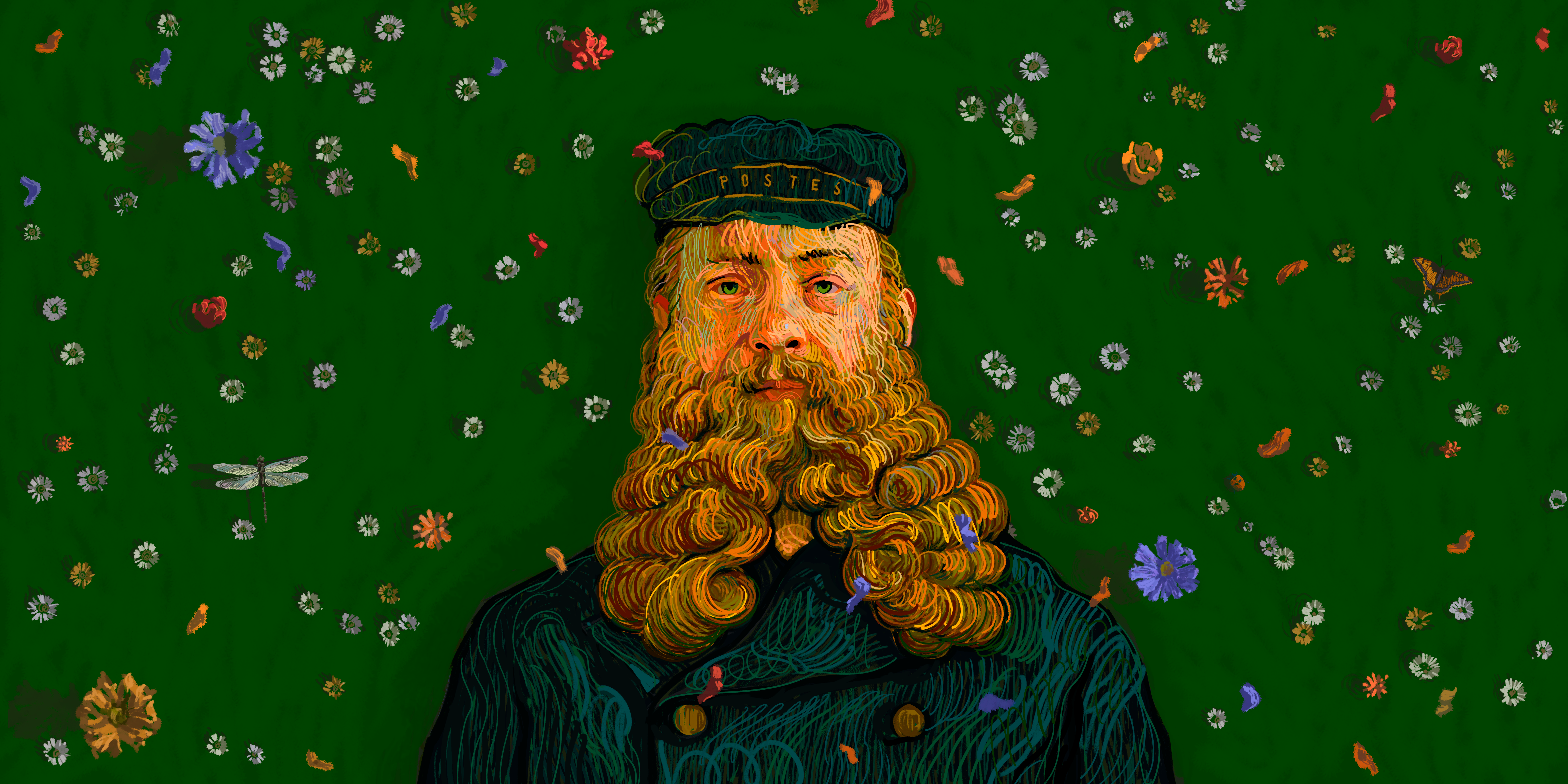
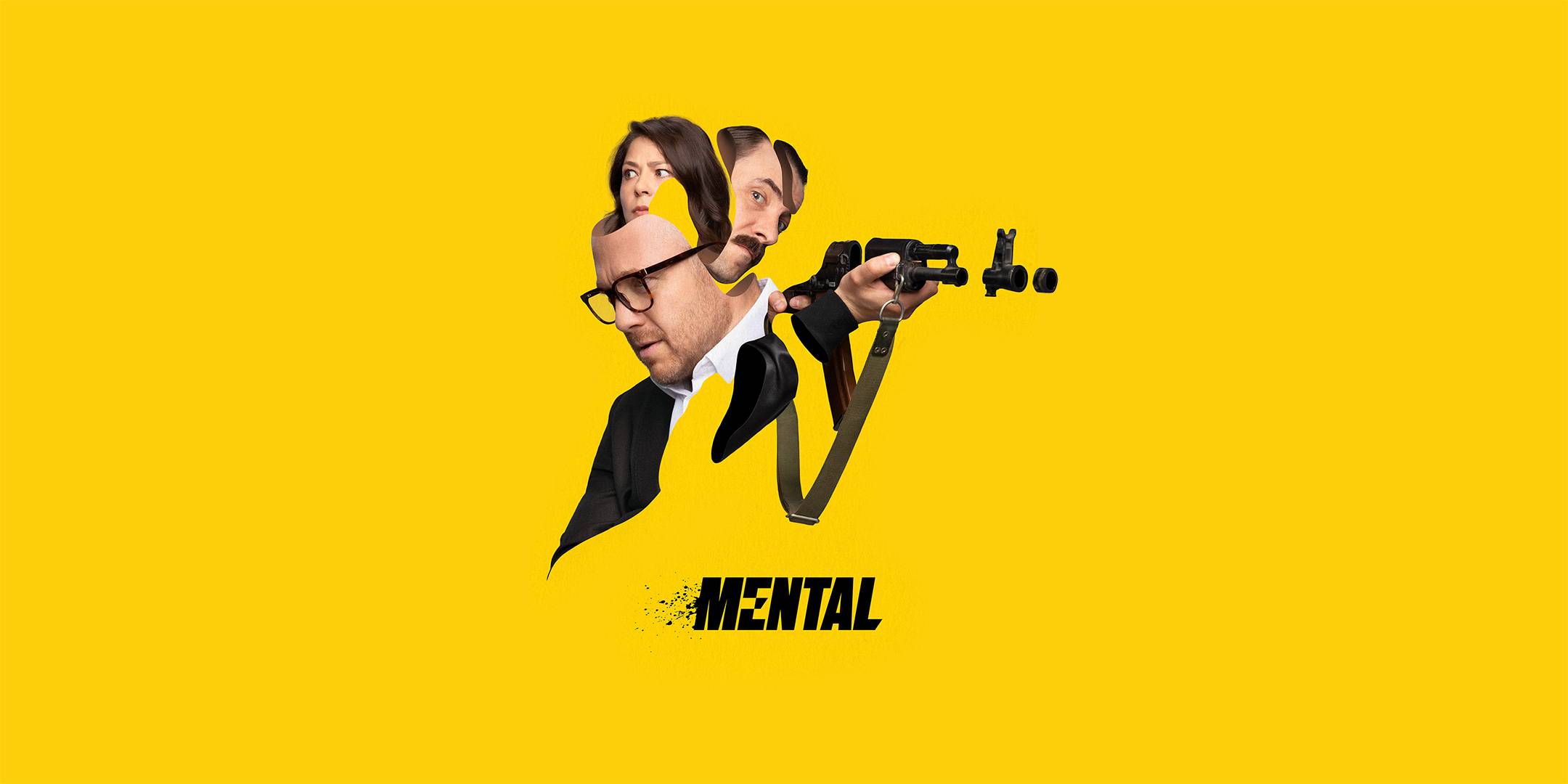
Logo and theatrical posters for Mental, the critically acclaimed dramedy series created by Aleksandr Doulerain.
View Project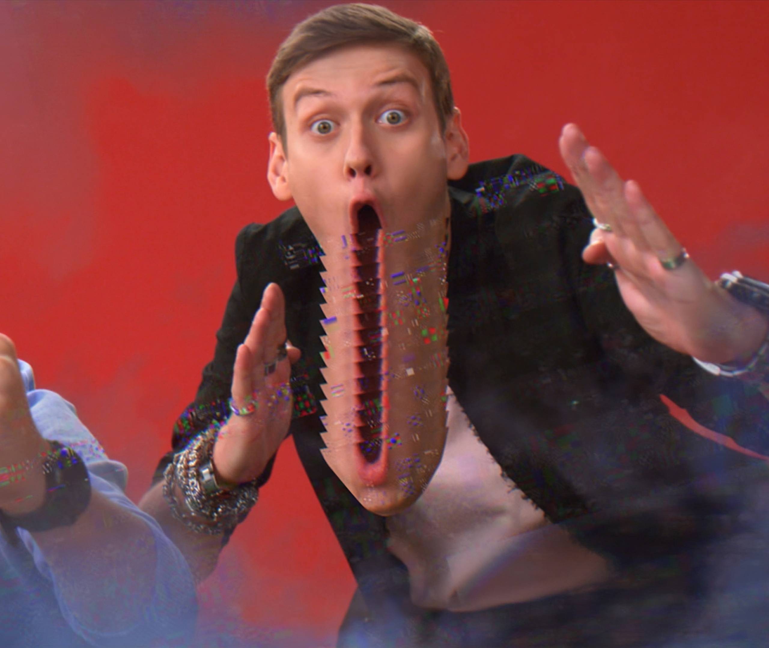
Redefining the design strategy of the flagship entertainment channel of the media holding.
View Project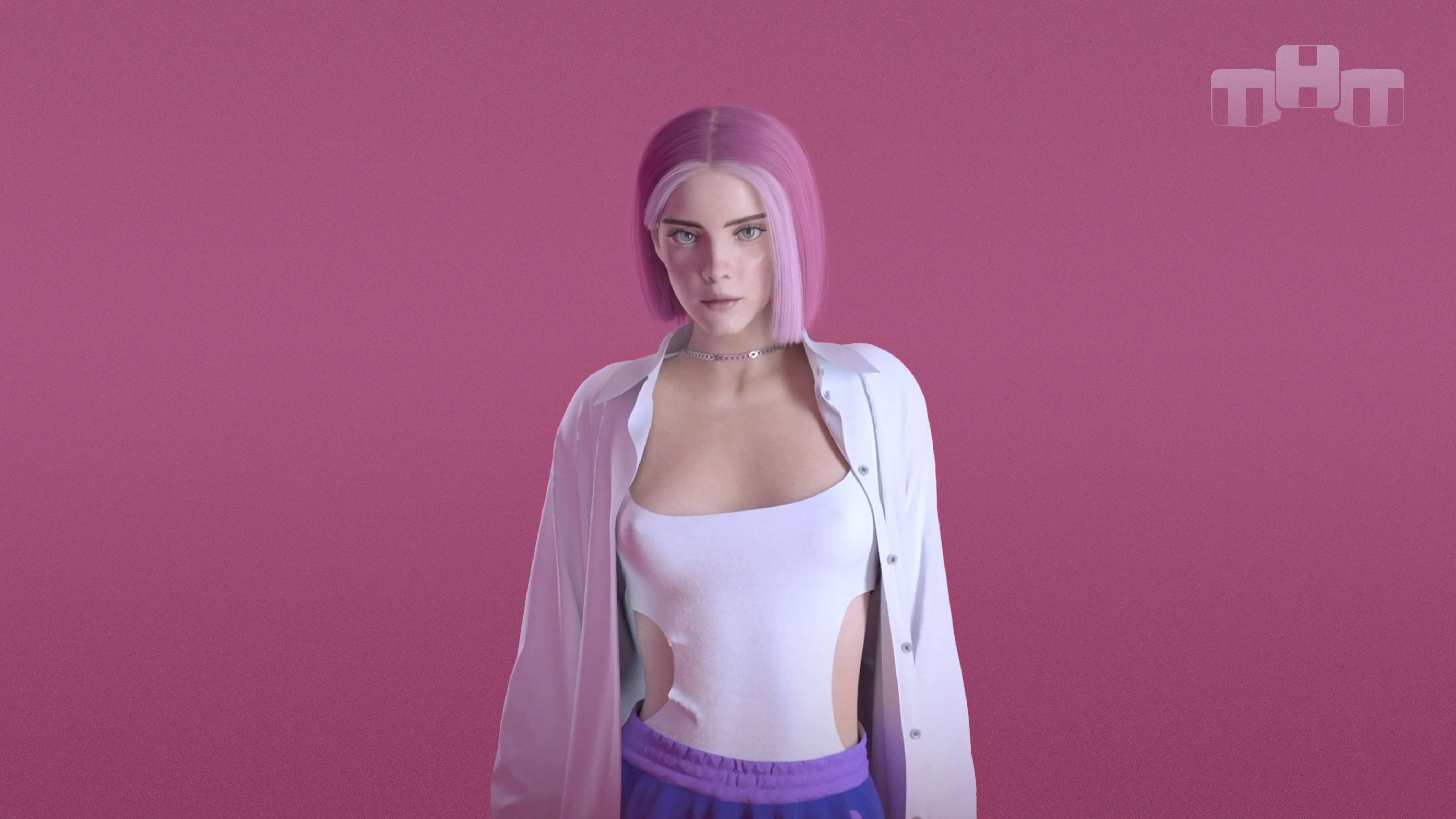
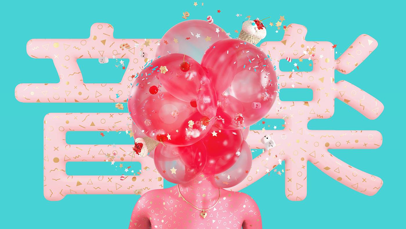

A collection of logos and wordmarks developed throughout the years.
View Project
Everyday life can be extraordinary, if you look it through the eyes of Real Time.
View Project
Helping Italy's 3rd broadcasting company to establish an umbrella brand for their 7 free to air channels.
View Project
Rebranding the first native digital channel on free to air market.
View Project
Refreshing one of most beloved youth brands across 60 countries.
View Project
Launching world class film company free to air TV channel and establishing an international brand for the small screen.
View Project